It has been a while between posts…I was busy running.
When I started this project I anticipated that there would be changes I would have to adjust to along the way. For example, I knew the tool I was using to extract my running data from Nike+ was being retired and that I was either going to have to write my own extraction tool or find a new one.
At this point of the project, I wasn’t ready to work with the Nike+ API, so I went and found another app that allowed me to simply login and pull my data from what I have uploaded from my GPS watch. I decided to use Tapiriik, which allowed me to sync my Smashrun account to Dropbox. The nice thing about using Tapiriik is that the run data is written to my Dropbox account automatically, so that the data is almost immediately accessible. In reality, relying on 4 different apps to get my data isn’t a good idea. Ideally I should pull my data from my Nike+ account directly, but for now this alternative works.
TCX?
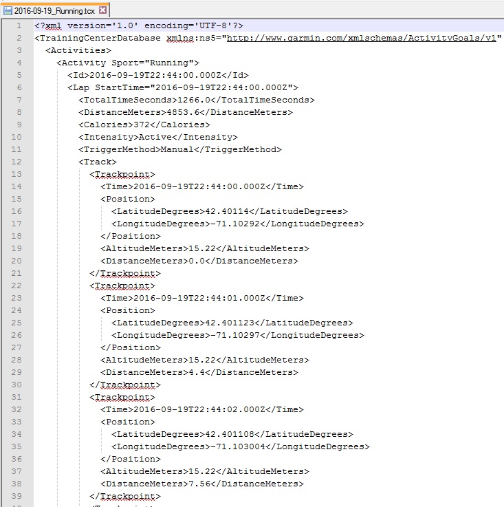
However, there was a change in the output run data using the process described above. The data delivered by Tapiriik from Smashrun to my Dropbox account was in the form of a TCX file. TCX files in the GIS world aren’t that common, meaning there aren’t many out-of-the-box tools in typical GIS software to handle them. The TCX is an XML based format developed by Garmin to store the typical data found in a GPX file, with additional information about the activity type. If you dig around the internet, you can find the TCX schema here.
Example TCX from Smashrun/Dropbox sync
Let’s Write Some Code
To get the TCX data into a usable format, I had to rewrite some of my parsing code (available on my GitHub account!), and search for additional python snippets to handle the TCX format. The TCXtoShape.py script is now up on my GithHub and handles this elusive format.
The script uses code I found on GitHub from JHofman. His fitnesshacks project has some good TCX parsing that I incorporated to build my input lists of points from the TCX file.
The TCXtoShape.py script works in a very similar fashion as the UpdateGPXdata.py script from the first phase of my project:
Parse the input TCX data
Create an input list for each run
Create the various distance/speed/time measures needed for future analysis
Build a line shapefile for each run with the attributes
I should figure out how to embed some code in this post…
Maps!
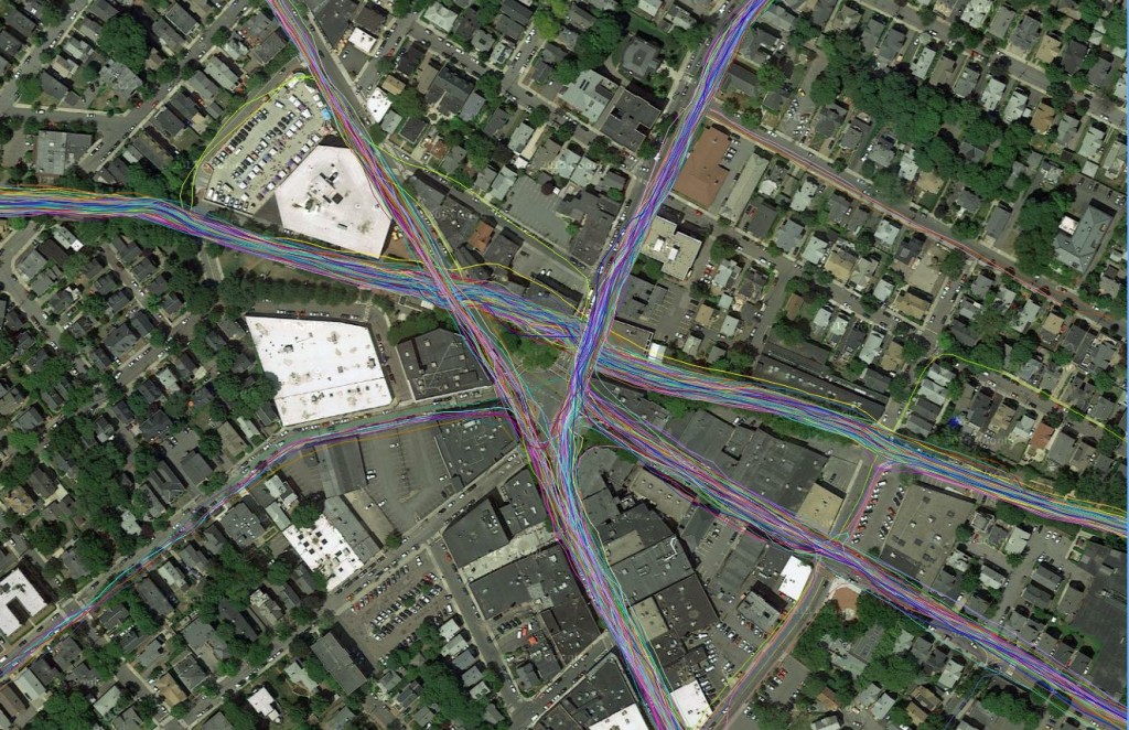
Using the TCXtoShape.py script, I reran all my runs from 2016 into a new set of shapefiles (206 so far). The output for the shapefile schemas between the different scripts, TCXtoShape and UpdateGPXdata.py, output he same formats, which will be good for when I build analysis tools. Using QGIS I have done a few quick visualizations to make sure the data looks good, but nothing fancy yet.
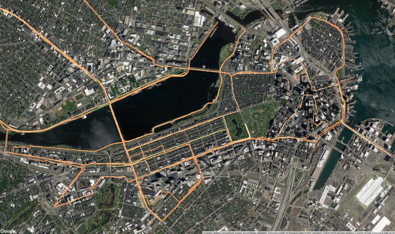
All 2016 Runs Through September, 2016
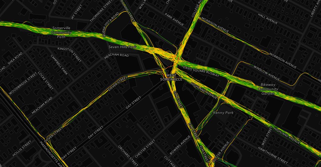
I calculate meters per second in the code, which can be visualized pretty easily in QGIS.
2016 Boston Runs, Visualized by Speed
Next up, I need to start developing the analysis to understand what all this is saying. But for now, I’ll just appreciate the data.
In 2016 I set a big goal for myself; get better at what I do. That includes geo-stuff, fitness stuff, personal stuff, and tech stuff. It’s spring time, so now is a good time to start another project.
I run. I run a lot. I also like data, maps, and analysis. I’ve been running for many years, but only since May 2014 did I start to use a GPS watch and track my runs through an app. I run with a TomTom Nike+ GPS sports watch. It has been a good sports watch. It is not as feature-rich as some of the new sport watches on the market, but it has a bunch of features not available in lower cost models. Having this watch is great, but that’s not the point of this project. This isn’t a watch review. This is a geo-nerd running man project.
I am calling this project runBENrun. The goal of the project is to get my data out of the Nike+ system and into my own hands, where I can analyze and visualize how I want to.
The first phase of this project will cover the data acquisition, cleaning, and early visualization testing – all with a geo/maps/GIS focus. Over the course of the next few months, there will be other posts about additional analysis,code, and visualization I take on with this very awesome geo-data.
One of the benefits of buying Nike’s watch, is that you get to use their website (update – Nike updated their site in early June 2016, so the screengrabs below are out of date, but the general idea is the same), where one can upload their workouts and see a number of pretty basic running stats like average speed, total time, miles run, and a choropleth map of the run. It’s not a heat map. Don’t call it a heat map. One can also view their previous runs and there are a number of milestones and badges that users can earn for any number of achievements.
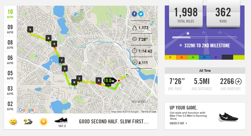
Screen grab of my 4/10/16 run – Overall, the Nike+ site is a pretty good free app
The app has been good, again, for a free service. I don’t complain about free. But, as I started getting more and more serious about my workouts, training for races, and improving speeds, the app only helped so much. I knew what I wanted to analyze the data more in depth.
The Goal
Beyond opening my data and getting insight from hundreds of runs and thousands of miles, I want to expand and improve on a number of my geo-skils. I want to use a few pythonlibraries I hadn’t explored before, get into more Postgres scripting and geo-analysis, and then really improve my web vis skills, since I haven’t done any web stuff in a long, long time.
Let’s get started.
Data, Data, Data
The first step in this project is to collect all my running data. When I started working on this project it was mid-February and I had over 300 runs stored in my Nike+ account. Unfortunately, Nike+ doesn’t have a quick export feature. I can’t just go and click a button in my account and say “export all runs”, which is a bummer.
Nike+ does has an API to collect data from the site, but I didn’t use it in this phase of the project. I used the since retired, Nike+ Data Exporter, a free tool provided for by Rhys Anthony McCaig. It was easy to use and provided easy to parse zipped GPX files. Overall, all of my run data was about a 100mb. I will eventually build my own tool to pull my run data from my Nike+ account.
Python is the Best
Once all the data was downloaded I needed to start processing the data. For this project, I decided to use the only language that matters: Python. I built a few scripts to process the data and start the analysis. The links here go to the gitbhub links for each script.
Rhys McCaig’s script returned GPX files and I had hundreds of them to parse through. This simple script uses the gpxpy library, with code assistance from urschrei’s script, the script converts the data from the GPX format to a flat text file for all files in directory.
The Update GPX Data script with where the magic happens, as most of the geo-processing happen here. The following points out some of the scripts highlights. Check out the code in github for all the details.
Uses a three specialized spatial python libraries, including fiona, pyproj, and shapely.
The script uses every other point to generate the lines and for speed and distance calculation. Using every other point saved on processing time and output file size, without distorting accuracy too much.
Manipulating dates and times
Calculating stats – average pace, meters per second, distance (meters, feet, miles). Meters per second is used in the visualization later on.
Shapely is used to process the spatial data.
Fiona is used to read and write the shapefiles files. I built a shapefile for each run.
Pyproj is used to change the coordinate system to make proper measurements between points.
If you are a geo-person I highly recommend checking out Shapely, Fiona and Pyproj.
The Results
I’ve run my code on my backlog of data. Here are a few things I have learned so far.
Number of Data Points – The Nike+ watch stores a point every ~0.96 seconds, so my average run (6 miles) logged about 5,000 points. When I process the data, I only kept every other point in the final shapefiles, but I did keep all the data points in the raw output. If I end up storing the data in a single table in PostgreSQL later on, I will need to think about the volume of data I will be generating.
Number Links – For a ten mile run in January, my output shapefile had over 2,300 links, which is very manageable.
Run Time – Most of the time I am in the “let’s make it work” and not the “let’s optimize this code”. Right now this code is definitely “let’s make it work”, and I am sure the python run times, which aren’t bad (a couple minutes max) can be improved.
Data Accuracy – With the visualization tests, so far, I am pretty happy with using every other point. With a personal GPS device, I expect some registration error, so if my run is exactly on a given sidewalk or road. For this project, “close enough” works great.
Early Visualization Tests
Once all the data was processed and the shapefiles were generated (I’ll get some geojson generation code to the project next), I pulled them all into QGIS to see what I had. At first I just wanted to look at positional accuracy. Since I am only using every other point, I know I am going to loose some detail. When zoomed out most maps look really, really good.
All runs through Davis Square
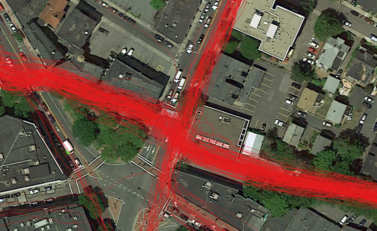
When I zoom in, some of the accuracy issues appear. Now, this isn’t a big deal. I am not using my GPS watch as a survey tool. Overall, I am very happy with the tracks.
Accuracy with every other point from GPS output – 2015 runs
The next step was to start to visualize and symbolize the tracks. Could I replicate the patterns I saw on the Nike+ website map using QGIS?
Yes. It was pretty easy. Because QGIS is awesome.
Using the meters per second data I calculated in the code, I symbolized it with a couple individual runs and then applied the defined breaks to all the datasets for a give year (using the mutliMQL plugin in QGIS) to get the following results. When I compare the color patterns to individual runs on my Nike+ account I get really good agreement.
Using QGIS to visualize all 2015 data
Using CartoDB
I wanted to get some of this data into an online mapping tool. As you all know, there are a growing number of options for getting spatial data online. I went with CartoDB. I chose CartoDB because Andrew Hill bought pizza for an Avid Geo meet-up once and it was good pizza. Thanks Andrew!
There is a lot to like about CartoDB. The tools are easy to use and provided plenty of flexibility for this project. I am a fan of the available tools and I am looking forward to getting more into the service and seeing what else I can do during phase 2 of runBENrun.
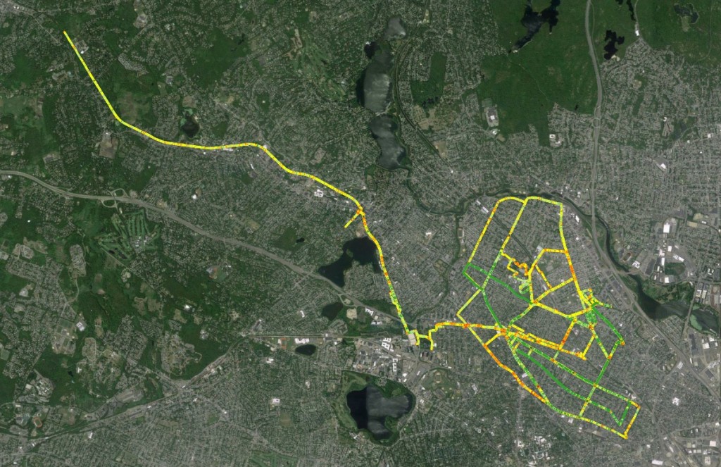
2014 – I ran along Mass Ave into Boston a lot
2015 – Pretty much only ran on the Minuteman Parkway bike path and a bunch of Somerville/Cambridge/Medford loops
All the data is in I generated in the code is in these maps. I didn’t trim the datasets down to get them to work in the CartoDB tools. That was nice.
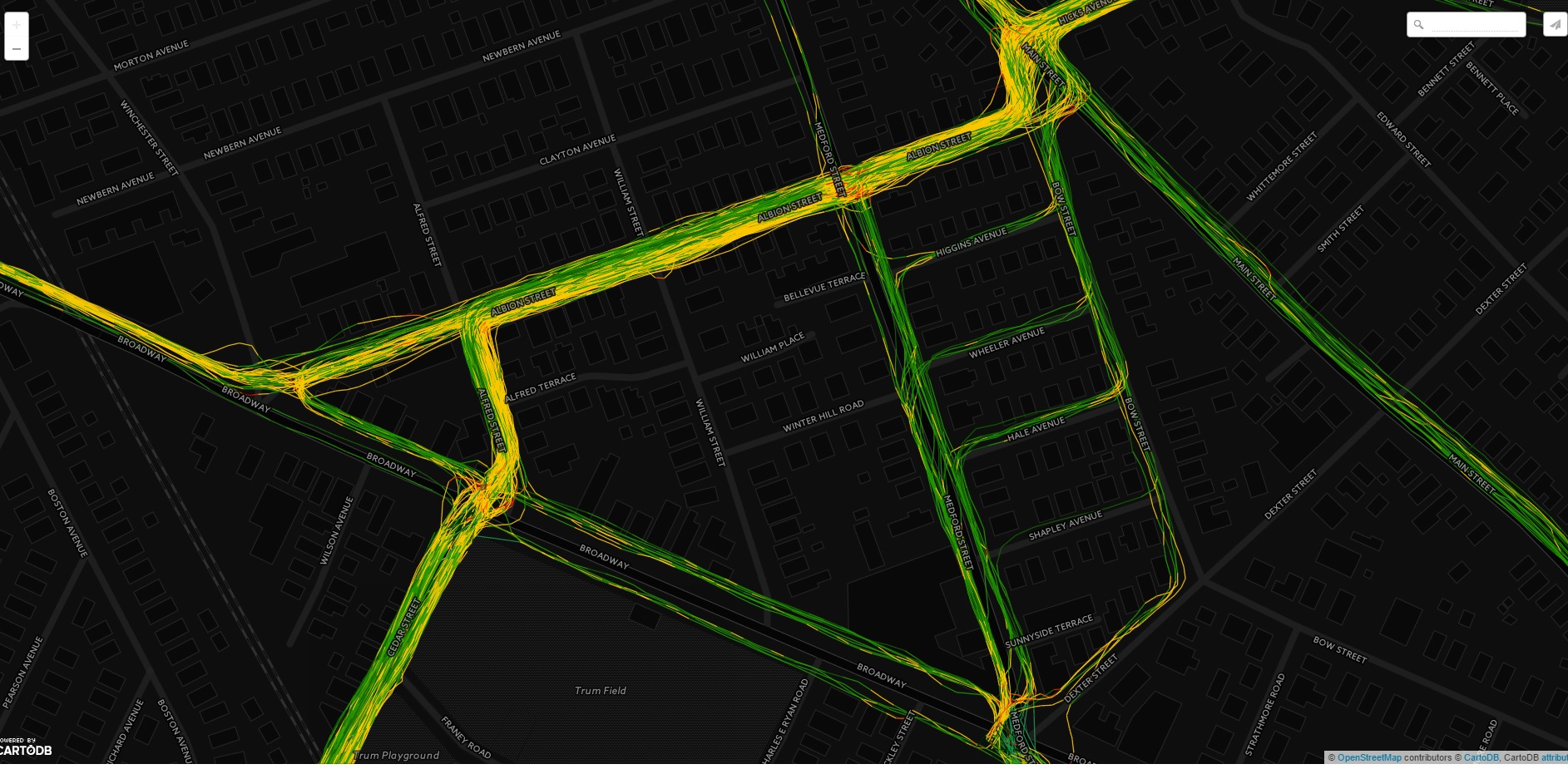
I really like this view of a bunch of my 2015 runs through Magoun and Ball Squares in Somerville/Medford.
I guess I don’t like running down Shapley Ave!
What’s Next
The data processing isn’t over yet and there is a lot of things to do before I can actually call this project finished.
With Rhys Anthony McCaig’s Nike+ exporter retired, I need to write some code to get my runs after January 2016.
I need to start the real analysis. Get more into calculating stats that mean something to me, and will help me become a better runner (and geographer).
Start expanding data visualization.
I would also like to simplify the code so that I can run a single script.
Run on every street in Somerville and South Medford!
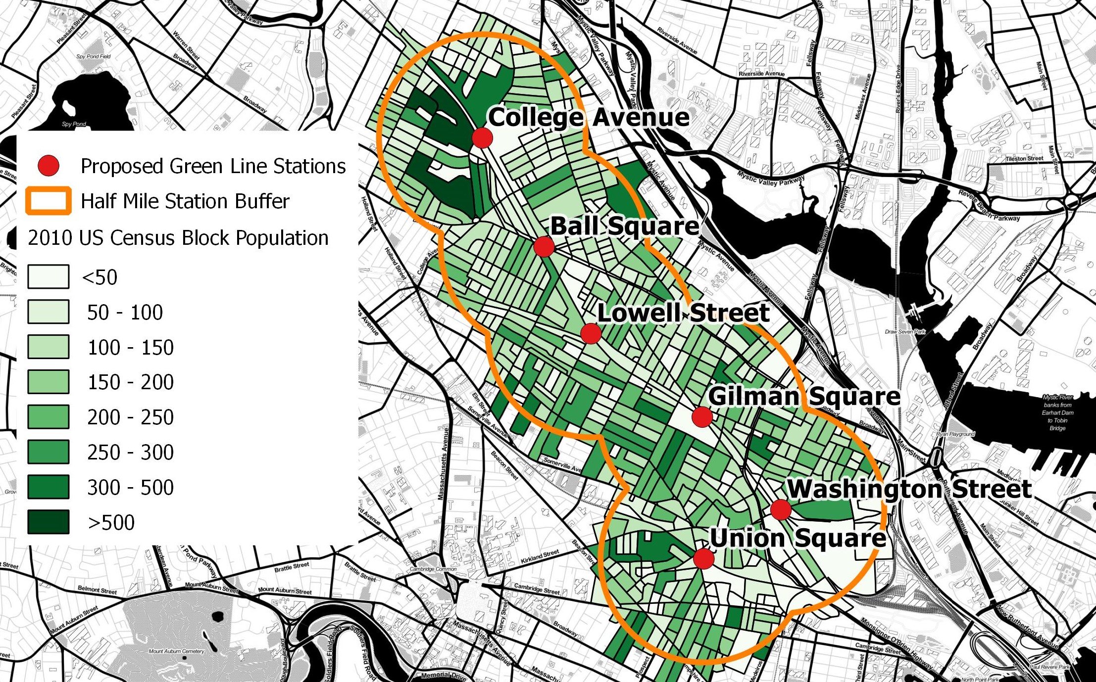
Recently, two State of Massachusetts transportation boards recently voted to approve the long awaited Green Line extension (maybe, hopefully, we’ll see, also the Feds are OK with the new plan). This is huge news, especially if you are an avid transit user, like I am. In the nearly six years I have worked in Back Bay and lived in Winter Hill I have never driven to work, relying on the bus network, and orange and red lines. The Green Line extension, for all it’s faults, is going to improve transit options for one of the most densely populated areas in not only the Boston region, but the entire country.
Being the armchair geographer I am, I wanted to take a quick glance at how the population in this relatively small area compared to other populations in Massachusetts using open data and open source software. According to the 2010 census, nearly 73,000 people (including me!) live within a half mile of a proposed station. The extension will run through several densely populated neighborhoods, originating from Lechmere in Cambridge and branching into two lines; one terminating at Tufts University at the College Avenue stop, and the other ending in Union Square.
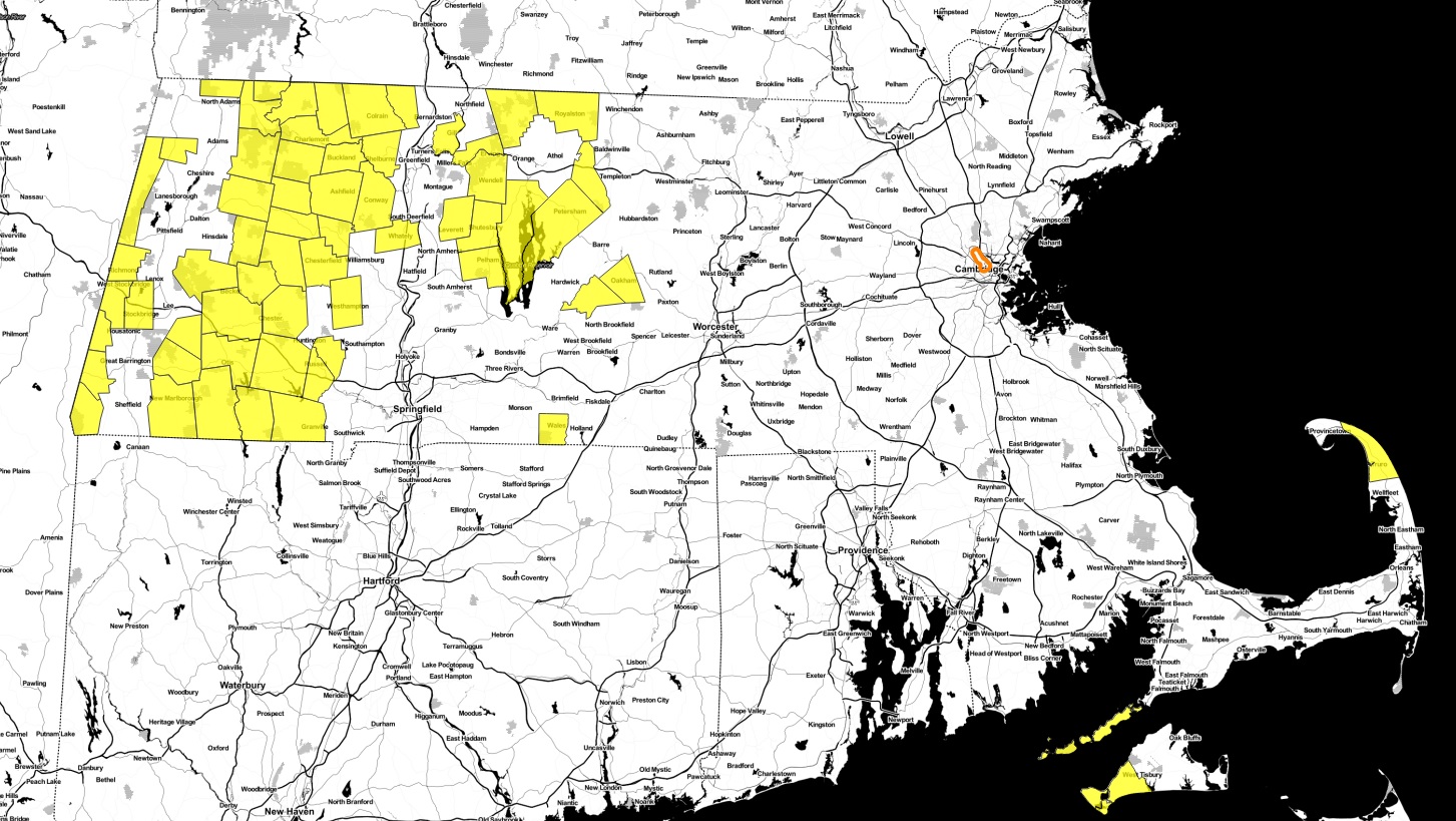
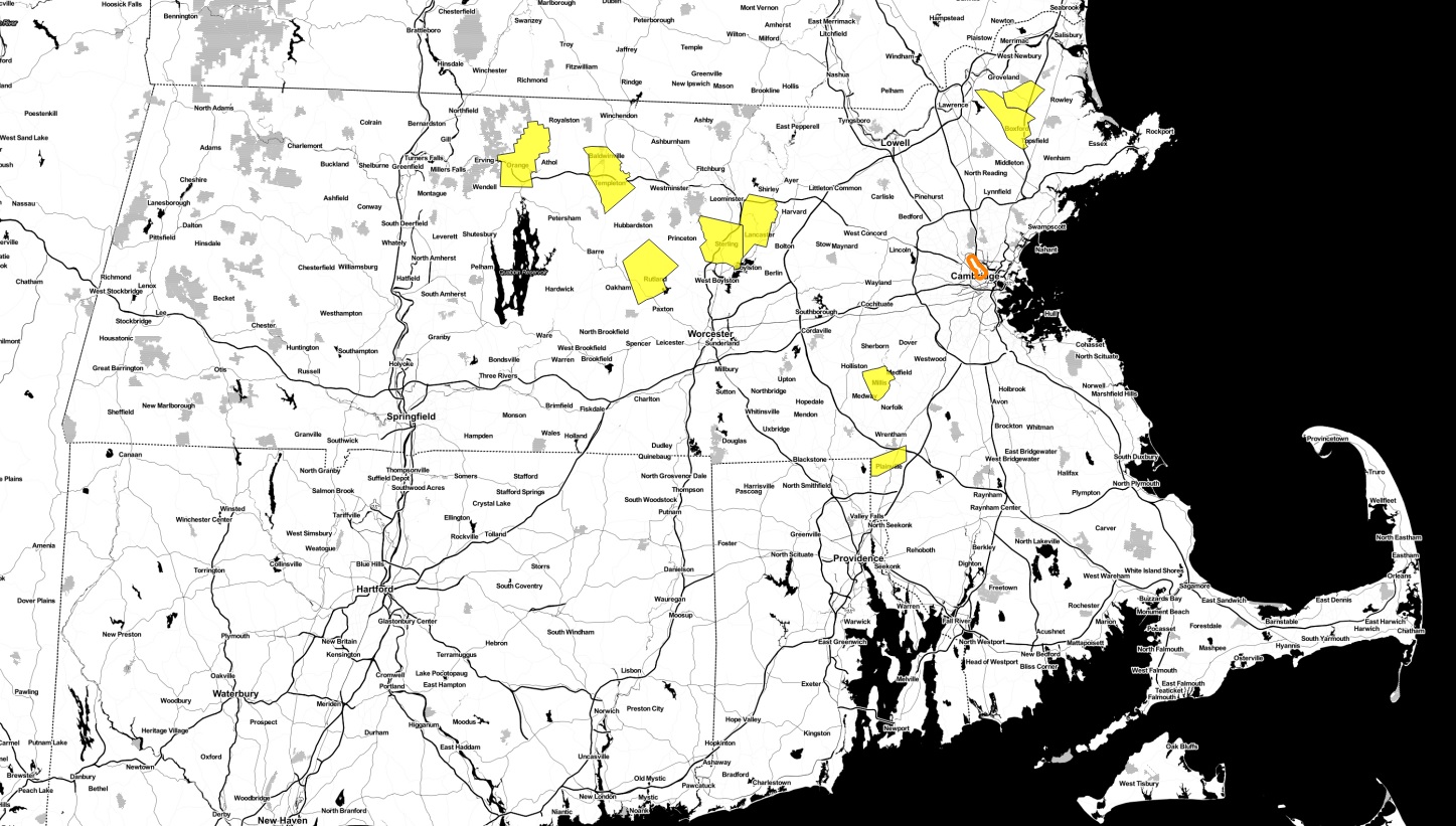
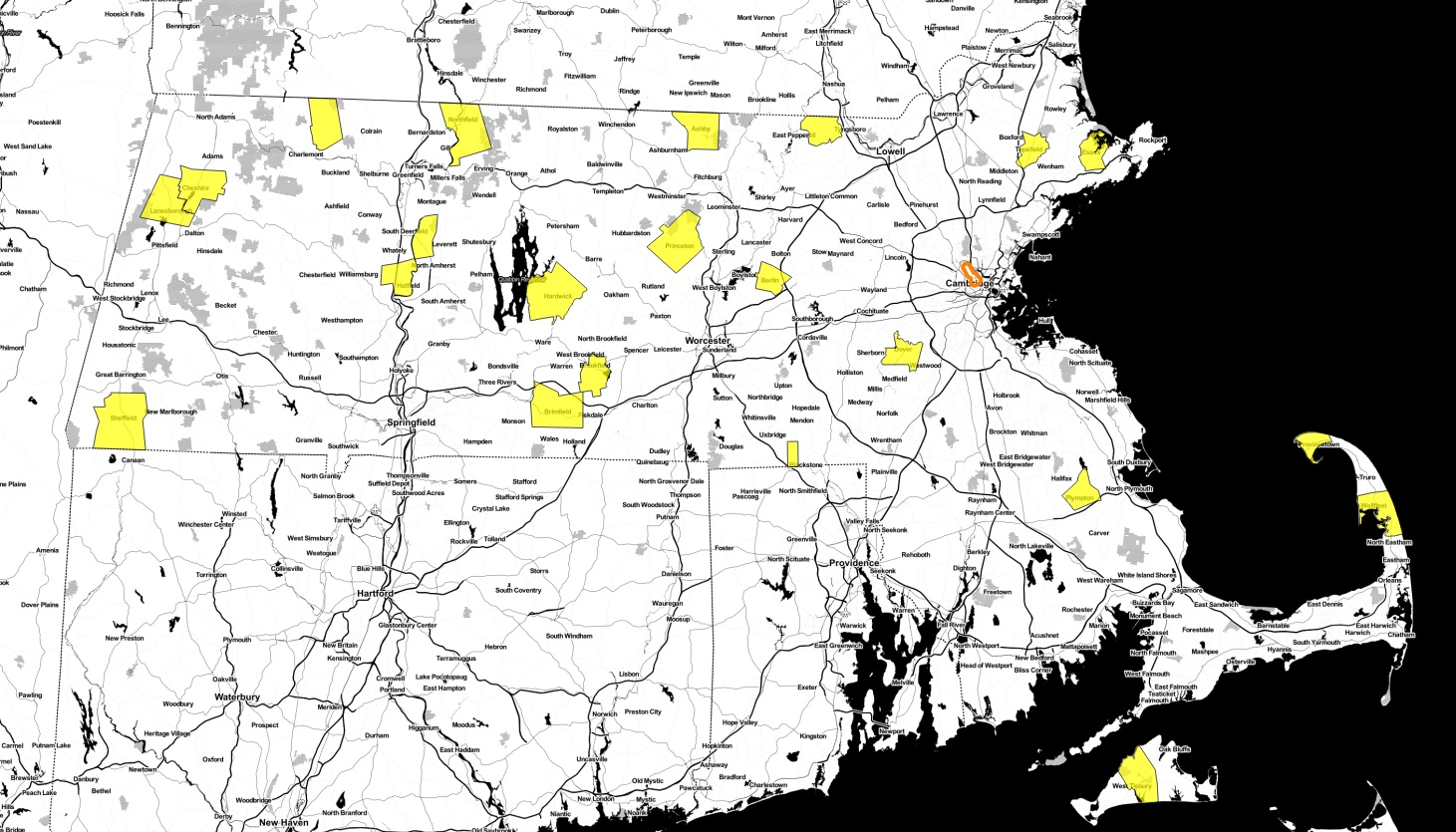
Let’s put those tightly packed 72,000+ people into perspective. With maps!
There are more people in this area than these 63 towns.
or these nine towns:
or these 22 towns:
No matter how you cut it, the Green Line Extension impacts a lot of people and will be a transformative project for the region.
A long time ago, in an apartment up the street, I put together a bunch of blog posts with simple examples of using Microsoft SQL for spatial data. Those blogs, aptly titled, Spatial SQL for the Geographer, still get a good amount of hits five years after they were originally posted.
Knowing that these old blogs still get traffic, I wanted to modernize them a little bit. As with all my 2016 projects, I wanted to do something I hadn’t done before, or improve a skill. So for this project, I moved all the scripts from the blog posts into my GitHub account:
The code is now much more accessible and not buried in the text of a blog post, which is really why I wanted to get them into GitHub.
The ReadMe has links to all the original blog posts. Those posts give an in-depth look into how the scripts work, references to MSDN documentation, and links to the original sample data download. I wanted to make sure this is still relevant, so I have tested the data and scripts though Microsoft SQL 2014 using their Express version. Everything works.
Check it out, make some improvements, or add some new script examples. Spatial analysis in Microsoft SQL Server isn’t that popular with geographers and geo-techies alike, but it does have it’s place. Hopefully these scripts help get someone started on the right path.
The next step is to translate these into PostGIS and put together a Spatial PostGIS for the Geographer post!
For 2016 I have a few goals. One of those goals was to contribute to OpenStreetMap more often. To get the year started off right I decided to contribute to OpenStreetMap (almost) everyday for the month of January. I haven’t taken on a big project in OpenStreetMap project in a couple years. In fact, I hadn’t done anything in two years! For someone who praises OpenStreetMap, I wasn’t contributing at all! My last map-out was the University of Connecticut’s main campus and I had only made one minor edit between then and my January map-a-thon.
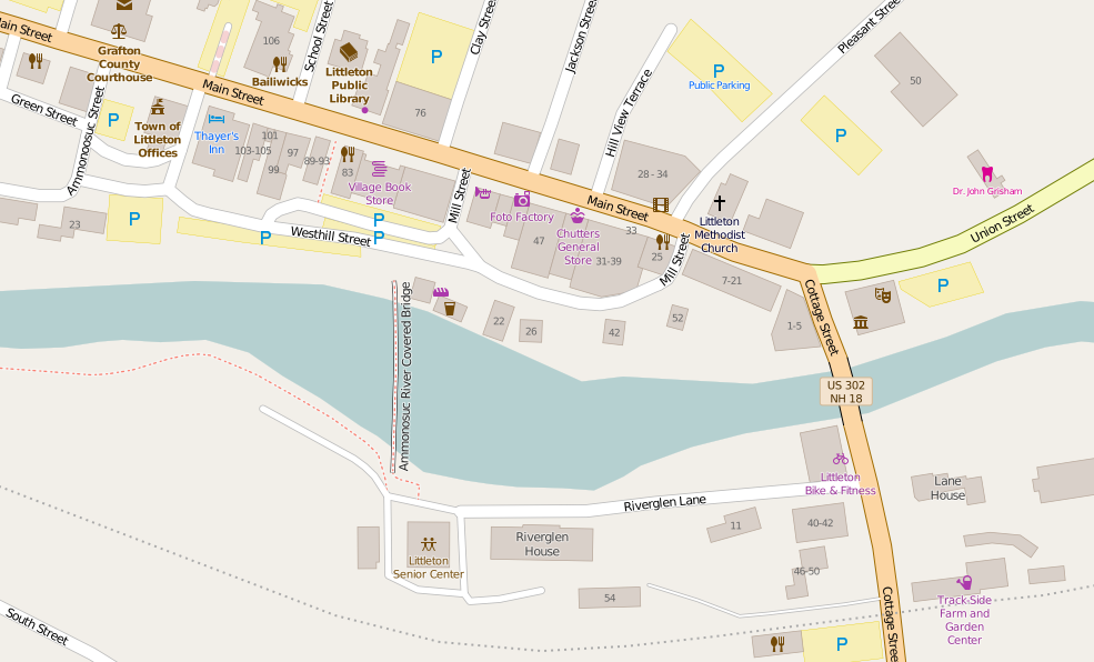
I needed a goal. I couldn’t just map all willy-nilly. I first thought of mapping where I currently live in metro Boston, but most of the area has been fully mapped for a long time. So, I shifted my focus north, to map out my hometown, Littleton, New Hampshire. It’s a small town in the White Mountains of northern New Hampshire. Littleton has recently become “cool” and has a burgeoning art scene. It’s a nice small town and it needed to be mapped.
The Plan
I started with pretty much a clean slate. Beyond what I would call the base layers (some cleaned TIGER roads, GNIS features, national forests, etc), there were only a few buildings and place markers in the town, some of which I added a while back. I figured if I mapped 15-30 minutes a night and a little longer on the weekends, I could get a big chunk of the mapping done by the end of the month.
I decided I was going to digitize buildings and improve as many other features as I could. My plan was to first focus on the features along the main roads in the densest parts of town, and then work into the neighborhoods. I also wanted to be consistent in my digitizing and attributing. That meant I used the same imagery, building type categories, and addressing schemes throughout the project. Consistency was key.
Data Sources
I used the Bing imagery available in the iD editor for digitizing features. For addressing and feature naming I used the Town of Littleton’s tax maps powered by Littleton based geo-consultants, CAI Technologies. Most probably wouldn’t professionally digitize using older leaf-on Bing imagery, but I used what was available. If was editing OpenStreetMap in QGIS or ArcMap I could have pulled in better imagery, but I wanted to use iD. To improve my accuracy, I would frequently cross reference with the tax data and Google images. I also used the Mapbox imagery to spot check locations as necessary.
Time Commitment
I planned for 15-30 minutes a night, and on the weekends I was able to commit to some longer time frames. On average my working sessions would last a little longer than 30 minutes.
The Results!
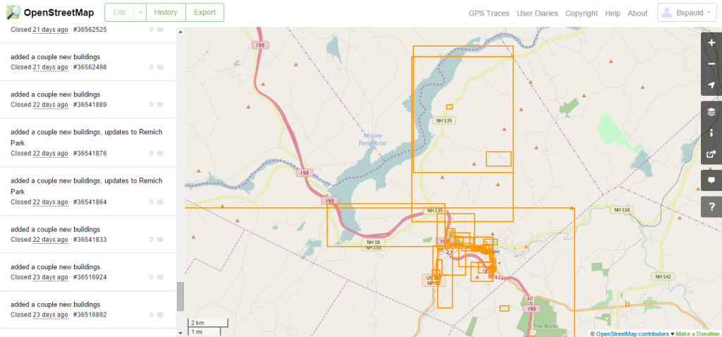
I mapped from January 11 until February 3- technically not a full month, nor all in January. I got a late start because I was too busy not starting other New Year’s resolutions. I also missed one Friday night and kept mapping into February because I didn’t realize it wasn’t January. My Changesets are visualized below. A couple times I did venture outside the borders of Littleton, mainly to add school building footprints.
Bspauld Changsets – 1/22/2016 to 2/3/2016
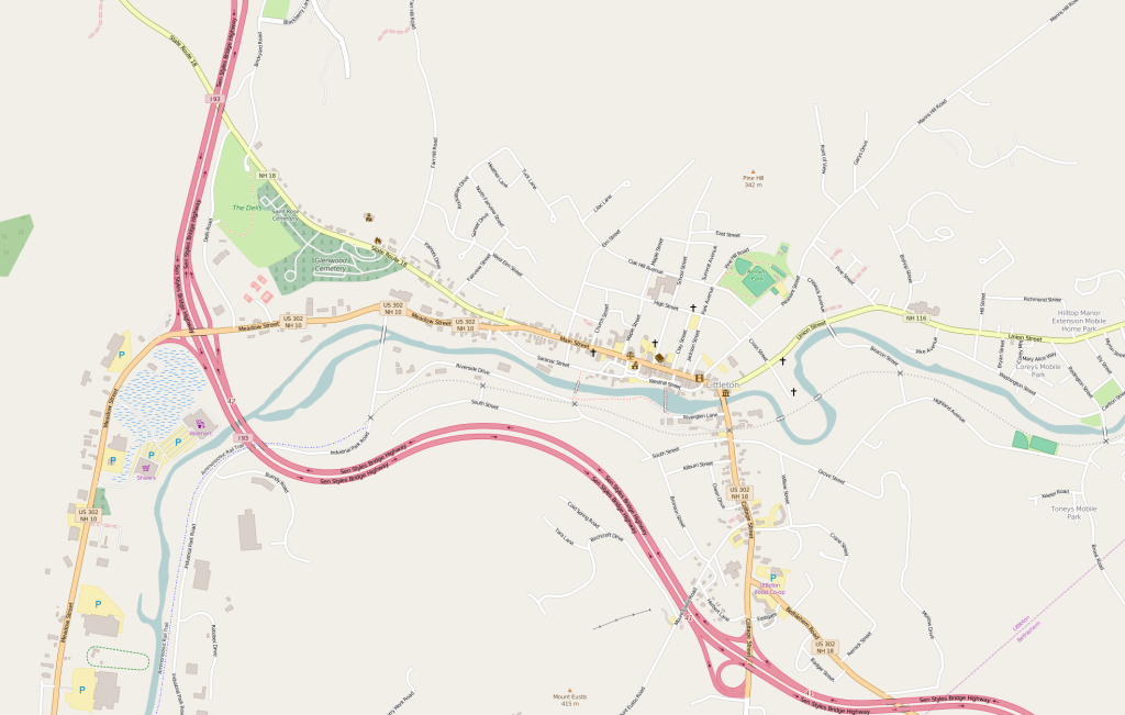
I didn’t get nearly as much done as I wanted to. I greatly over estimated how much I could get done each night. I thought I would be able to get a majority of the buildings digitized and addressed in the downtown area and along the main roadways. I was able to get the main buildings completed along the core roadways, but I didn’t even touch many of the side streets and smaller neighborhoods. I was able to clean-up and update a number of existing features, including many of the points of interest that were already there.
View of Littleton, NH – I mapped maybe 20% of my goal
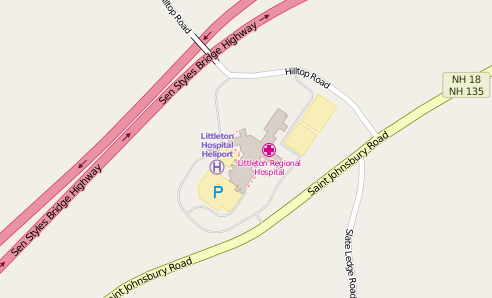
When I realized that I wasn’t going to meet my goal I switched gears. I started to add and update as many “important” features into OpenStreetMap. That included the local hospital, schools, parks, important businesses, tourist locations, and my parents house.
Littleton Regional HospitalAdding Commercial Buildings, Including Jack’s Lazer Car Wash
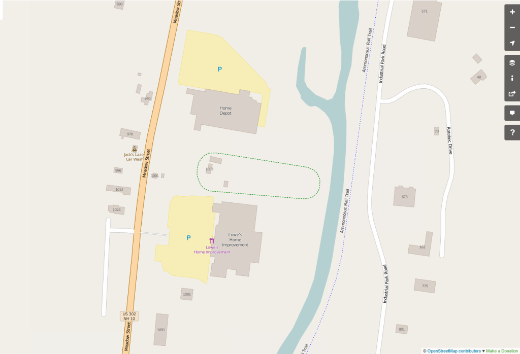
When I got the “important” features completed, I spent most of my time focusing on the downtown area. Littleton is a central town to the larger region, so I figured focusing on the central business district would have the biggest impact on future users. As I mentioned, some of this area was already digitized before I started my project from some work I did a few years ago, and by other contributors. I cleaned-up existing features and added new ones. I plan on going back and adding more businesses and landmarks when time allows.
Fun fact: Littleton is home to the world’s longest candy counter, located in Chutters General Store.
I am a professional geographer. There was one time in my career when I was paid to do this type of digitization, so I had an idea of what I was getting myself into when I started this project. I knew I was going to have some issues with accurate digitization using an older low resolution Bing dataset. If you compare my building footprints to what CAI has done there are differences. I expect that, and most geo-professionals would. For the most part, the features I updated and added are pretty good. They will work wonderfully in OpenStreetMap for years to come. But, if you want official building footprints, give the Town of Littleton a call.
I used iD as my primary data editing tool. Working with iD is awesome. The usability of the tool is incredible. If you have used desktop GIS to mass edit geo-features and then have used iD for OpenStreetMap projects, you’ll never want to go back to those desktop programs. It is such a fluid tool, from drawing to attributing. From tool options appearing when hovering over features in the map to type-ahead aiding the Search option, iD gets a lot of things write when it comes to geospatial data editing. I love it. Mapbox has done a lot of amazing stuff over the past few years and iD is way up on my list of Mapbox awesome.
There is a lot left to do in this project. Even though the blog is done, the mapping is not. I will continue contributing on a regular basis until I am done. I took on this project because I wanted to challenge myself and to get back into contributing to OpenStreetMap more regularly. I think I met both of those objectives. I hope the results benefit the OpenStreetMap community and the community of Littleton!
I encourage you to check out your hometown in OpenStreetMap. If looks a little empty, maybe you should start to map it.
Welcome to the future, 2016. It’s nice to meet you.
2015 was a great year. I did a lot of cool stuff, and almost all of it wasn’t geo-related. Seriously, like 95% of the things I did this year had nothing to do with geo or GIS. That’s all fine and good, but I really love geo. I went to school for a long time to just kinda give up on it in the past year.
During the last few days of 2015 I made a list of things I want to do in 2016. The list is fairly short. I want to start to learn Mandarin Chinese, become a better runner, read more, remember my passwords to stuff, and get better at what I do. Geo is “what I do” and I really want to get better at it in 2016.
I know the path to meeting a couple of my 2016 goals, but how do I get better at geo? I’ve been working in geo for almost 10 years. I have a job that allows me to challenge myself on a regular basis, and do a lot of geo work.
In this case, I think the path to getting better is by doing more. Practice makes perfect. In 2016 I will strive to create more maps, tools, algorithms, datasets or anything else. This, I hope, will force me to learn new skills, hone my existing skills, and inspire me to try new things and test new ideas. I won’t just leave ideas written down on a post-it note on my desk.
I will make some maps from those ideas I have written down, post tools and code I create to my deserted github account, write more technical and research/analysis GISDoctor.com posts (even if they aren’t any good), contribute to my local geo-community, and make a real effort to add to OSM more than I have in the past.
By doing more, I think I can keep challenging myself to expand but also refine and tighten my geo-skills. More importantly, I will keep myself motivated and interested in geo! I’ve definitely already put the first 10,000 hours in. Maybe the next 10,000 will really define who I am as a professional geographer and member of the geo-community.
Here’s to what is hopefully the most productive and inspiring geo-year of my life!
Let’s wrap-up the year with a few things I learned in 2015.
95% of all the maps you see on the internet, or that you make for your own purposes, could probably be replaced with a nicely formatted table. The exception – those cool web maps that show animation with some sort of time value. Those are rad.
QGIS, R, python, and PostGIS keep getting better and better.
ArcGIS Pro, at least for me, totally missed the spot.
Formatting and sharing data is easy. Knowing how to properly analyze it when you have it takes skill.
Everyone has big data and no one has big data.
I really don’t care about online mapping. It’s cool, but I am a technical analyst, and numbers and stats are more important to me in my line of work. However, I see the incredible value of what CartoDB, MapBox and others are doing to push the geo-tech agenda forward.
Don’t believe anything you read in blogs or on twitter. Especially mine 🙂
Using “Geo” as a prefix automatically makes you look like you know what you are doing.
All the cool kids are doing geospatial analysis (see what I did there…).
Spatial isn’t special. If it really was, we would all be making a lot more money.
If you are young, in college, and interested in GIS, I recommend you go into a natural/earth science or engineering field. Learn some stats, and get some programming. You will either learn how to use GIS on the side in a required course or in the job you got with your degree in your technical field where you learned how to do analysis. I don’t think majoring in “GIS” is a good idea anymore.
side note – If you want major in geography, make sure you go the quantitative/technical route.
I hope 2015 was great for everyone. I am glad I started blogging again and I am glad people are still reading my posts. I have big plans for 2016! Now, let’s see if I actually implement those plans…
Happy Thanksgiving! I’ve been running a lot recently, and when I run, I think. Here are a few things that have been bouncing around my brain while dodging traffic.
Is it just me, or is every “viral” map that hits the internet lately powered by either CartoDB or Mapbox? It’s pretty impressive to see these two companies gain traction and grow, especially in the non-traditional geo-crowd. If anyone one sees a “viral” map from Esri, that wasn’t made by Esri, let me know.
Recently at work I’ve been building a custom interpolation algorithm to analyze some model output. The out-of-the-box tools in the standard GIS suites usually aren’t flexible or fast enough for my work, so I have been using scipy and numpy to code some stuff up. I hadn’t used the spatial component in scipy until this project. Scipy spatial, in combination with numpy, has been a powerful alternative for coding the analysis. If you haven’t, you should check it out. Since I am working in a modeled spatial environment (sparse and standard grids), I’ve been using Jupyter Notebook for an IDE and matplotlib for on-the-fly visualization, both of which are awesome.
I am excited that Boston has been chosen as the host city of FOSS4G 2017! I haven’t been to a FOSS4G conference yet, but I am 100% going to FOSS4G in 2017. Big thumbs up to Avid Geo, the folks at AppGeo, and others in the Boston geo-sphere who put the proposal together. FOSS4G is the future of geo and GIS. There is no ifs, ands or buts about it.
Rant time – We, as an industry, need to get colleges and universities to stop providing (or drastically improve) GIS certificate programs (also, we need to end “technical certifications”, but that’s a whole other rant). For the most part, many don’t do enough to really help someone trying to become a geo-professional or improve their skills if they are already working in the field. In many cases, I believe they can railroad students into a skillset that is really only viable in the very narrow role of a GIS technician. Those departments that teach GIS and geospatial analysis should work more on developing and integrating cross discipline geospatial curricula that provides technological depth, solid analysis skills and strong problem solving skills. All too often I have seen the “Open ArcMap, push some buttons, use some shapefiles, and make a crappy map project route” approach to fulfill requirements. This is a horrible disservice to students, many of whom are competing for jobs that are becoming increasingly tougher and tougher to land. Geospatial higher education has to be better. Colleges and universities don’t need to be career training centers, but they should teach the skills necessary to for their students to be able to compete in today’s environment.
Go read the blog post that Bill links to from Mapzen and then come back here.
I love OpenStreetMap. It’s the best. In my opinion, it’s the most important thing to have happened to the geo community since Dr. Tomlinson started working with map overlays in the 1960s*.
Geo-tech has rapidly grown and matured over the past two decades. Not long ago, most things GIS and geo-tech were reserved for governments (local to national) and academic institutions. Thankfully, that isn’t the case in today’s world. Geo-thinking and geo-tech is everywhere and OpenStreetMap is a major reason why.
But how has OpenStreetMap helped make location and geo so prevalent to a growing variety of industries and institutions outside of government and academia? Why is that story that Bill linked to so important? I think there are a few reason.
OpenStreetMap has greatly expanded access to geo data worldwide – When OpenStreetMap started over ten years ago it was created as a response to limited geo data access, primarily in the UK. From those early days to now OpenStreetMap, and its many partners, have made access to both consuming and contributing data increasingly more easy and efficient – for anywhere in the world. Here in the US of A we have always had pretty great access to some level of geo-data, but that hasn’t always been the case in many other countries. Beyond opening up data resources, OpenStreetMap has also helped introduce spatial data to a wide audience, including many with very little knowledge of geo as perhaps you or I know it. That’s awesome.
It is open(and flexible) – Some early detractors (including myself) were once worried about OpenStreetMap undercutting the “authoritative” and “established” (and for cost) data providers in the marketplace. I think there was an early worry about data quality and data trust. I believe that almost all of those worries are now gone. The fact that anyone with a web connection can view or edit the data makes it that much more powerful. And because it is open, I believe the people who contribute (many of whom are “pros”) take their adds and edits very seriously. I know I do. OpenStreetMap is also incredibly flexible. Even though the commercial data vendors have gotten much faster at incorporating updates (in general, governments are still slow), OpenStreetMap is known for its ultra-fast updates, primarily due to its dedicated community of contributors. That, to me, is one of its greatest advantages. The data is never old on OpenStreetMap.
It is for the greater good – One of my favorite things about OpenStreetMap is its large and dedicated community. One of the best parts of this community has been HOT OSM, whose members help coordinate updates to OpenStreetMap to areas impacted by natural or humanitarian disasters. The data they develop in the hours and days after a major event (for a great example, look at their work following the 2010 Haiti earthquake ), especially in developing regions, is critical to many, including those on the ground aiding relief efforts. See also @TheMissingMaps project.
It has enabled an emerging industry to grow – OpenStreetMap has forever changed the way we look at geo-data and the technology surrounding it. This change in perspective has helped foster a growing number of geo-enabled companies. Would companies like Boundless, CartoDB, Mapzen, Mapbox, or Mapkin be as successful if OpenStreetMap wasn’t around? Maybe. Maybe not. What about the success of the Leaflet API, or the growth of FOSS4G? Would they have been as important in the geo and tech worlds if it wasn’t for OpenStreetMap? Probably, as they are both awesome. However, I believe that because of OpenStreetMap and all that it provides and all that it stands for, that these types of organizations, ideas, and companies will continue start-up and contribute positively to our profession.
So, let’s go back to the beginning of the post. Why did I link the tweet from Bill about Mapzen’s latest efforts regarding Mapzen Search? Well, I think their work, along with many others, is proof of how valuable OpenStreetMap really is and will continue to be. The OpenStreetMap community is maturing and the industry surrounding it is expanding. We have only seen the tip of the proverbial iceberg when it comes to the potential of OpenStreetMap and what it can do. I look forward to being apart of what’s next.
You should too.
* sidenote, GPS came in a very close second
Honorable mentions for “Most Important thing in Geo” – GPS, QGIS, TIGER, ArcView 3.2, Landsat, Smartphones
Feel free to use this everywhere. Print it out and hang it on your wall.
My biggest geospatial pet peeve is when people confuse the relationship between x/y and lat/long. I believe this is a fundamental concept in geography and I am here to reintroduce you to math you probably learned in elementary school (middle school maybe?). If you already know the proper x/y-long/lat relationship then you can skip the rest.
First, let’s review the Cartesian coordinate system. The X axis is the horizontal plane and the Y axis is the vertical plane. Two dimensional. Pretty simple.
Now, let’s look at latitude and longitude. Latitude measures angular distance from the equator to a point north or south of the equator. While longitude is an angular measure of east/west from the Prime Meridian.
Now this is the important part.
Latitude values increase or decrease along the vertical axis, the Y axis.
Longitude changes value along the horizontal access, the X axis.
Easy. X = Longitude, Y = Latitude. Now you will no longer be confused when calculating centroids or setting webmap coordinates.