In 2016 I set a big goal for myself; get better at what I do. That includes geo-stuff, fitness stuff, personal stuff, and tech stuff. It’s spring time, so now is a good time to start another project.
I run. I run a lot. I also like data, maps, and analysis. I’ve been running for many years, but only since May 2014 did I start to use a GPS watch and track my runs through an app. I run with a TomTom Nike+ GPS sports watch. It has been a good sports watch. It is not as feature-rich as some of the new sport watches on the market, but it has a bunch of features not available in lower cost models. Having this watch is great, but that’s not the point of this project. This isn’t a watch review. This is a geo-nerd running man project.
I am calling this project runBENrun. The goal of the project is to get my data out of the Nike+ system and into my own hands, where I can analyze and visualize how I want to.
The first phase of this project will cover the data acquisition, cleaning, and early visualization testing – all with a geo/maps/GIS focus. Over the course of the next few months, there will be other posts about additional analysis,code, and visualization I take on with this very awesome geo-data.
All of the scripts I am putting together will be on my now back-from-the-dead github account. Feel free to check them out!
The Problem
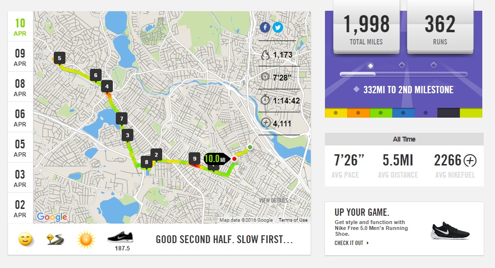
One of the benefits of buying Nike’s watch, is that you get to use their website (update – Nike updated their site in early June 2016, so the screengrabs below are out of date, but the general idea is the same), where one can upload their workouts and see a number of pretty basic running stats like average speed, total time, miles run, and a choropleth map of the run. It’s not a heat map. Don’t call it a heat map. One can also view their previous runs and there are a number of milestones and badges that users can earn for any number of achievements.
The app has been good, again, for a free service. I don’t complain about free. But, as I started getting more and more serious about my workouts, training for races, and improving speeds, the app only helped so much. I knew what I wanted to analyze the data more in depth.
The Goal
Beyond opening my data and getting insight from hundreds of runs and thousands of miles, I want to expand and improve on a number of my geo-skils. I want to use a few python libraries I hadn’t explored before, get into more Postgres scripting and geo-analysis, and then really improve my web vis skills, since I haven’t done any web stuff in a long, long time.
Let’s get started.
Data, Data, Data
The first step in this project is to collect all my running data. When I started working on this project it was mid-February and I had over 300 runs stored in my Nike+ account. Unfortunately, Nike+ doesn’t have a quick export feature. I can’t just go and click a button in my account and say “export all runs”, which is a bummer.
Nike+ does has an API to collect data from the site, but I didn’t use it in this phase of the project. I used the since retired, Nike+ Data Exporter, a free tool provided for by Rhys Anthony McCaig. It was easy to use and provided easy to parse zipped GPX files. Overall, all of my run data was about a 100mb. I will eventually build my own tool to pull my run data from my Nike+ account.
Python is the Best
Once all the data was downloaded I needed to start processing the data. For this project, I decided to use the only language that matters: Python. I built a few scripts to process the data and start the analysis. The links here go to the gitbhub links for each script.
- Rhys McCaig’s script returned GPX files and I had hundreds of them to parse through. This simple script uses the gpxpy library, with code assistance from urschrei’s script, the script converts the data from the GPX format to a flat text file for all files in directory.
- Quick script to loop through all the datasets and give them names that made sense to me. It’s pretty simple.
- The Update GPX Data script with where the magic happens, as most of the geo-processing happen here. The following points out some of the scripts highlights. Check out the code in github for all the details.
- Uses a three specialized spatial python libraries, including fiona, pyproj, and shapely.
- The script uses every other point to generate the lines and for speed and distance calculation. Using every other point saved on processing time and output file size, without distorting accuracy too much.
- Manipulating dates and times
- Calculating stats – average pace, meters per second, distance (meters, feet, miles). Meters per second is used in the visualization later on.
- Shapely is used to process the spatial data.
- Fiona is used to read and write the shapefiles files. I built a shapefile for each run.
- Pyproj is used to change the coordinate system to make proper measurements between points.
- If you are a geo-person I highly recommend checking out Shapely, Fiona and Pyproj.
The Results
I’ve run my code on my backlog of data. Here are a few things I have learned so far.
- Number of Data Points – The Nike+ watch stores a point every ~0.96 seconds, so my average run (6 miles) logged about 5,000 points. When I process the data, I only kept every other point in the final shapefiles, but I did keep all the data points in the raw output. If I end up storing the data in a single table in PostgreSQL later on, I will need to think about the volume of data I will be generating.
- Number Links – For a ten mile run in January, my output shapefile had over 2,300 links, which is very manageable.
- Run Time – Most of the time I am in the “let’s make it work” and not the “let’s optimize this code”. Right now this code is definitely “let’s make it work”, and I am sure the python run times, which aren’t bad (a couple minutes max) can be improved.
- Data Accuracy – With the visualization tests, so far, I am pretty happy with using every other point. With a personal GPS device, I expect some registration error, so if my run is exactly on a given sidewalk or road. For this project, “close enough” works great.
Early Visualization Tests
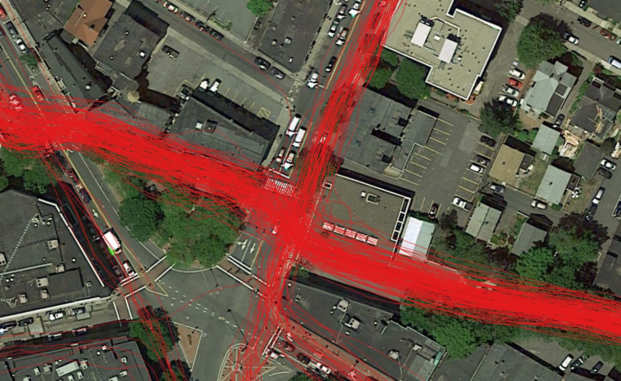
Once all the data was processed and the shapefiles were generated (I’ll get some geojson generation code to the project next), I pulled them all into QGIS to see what I had. At first I just wanted to look at positional accuracy. Since I am only using every other point, I know I am going to loose some detail. When zoomed out most maps look really, really good.
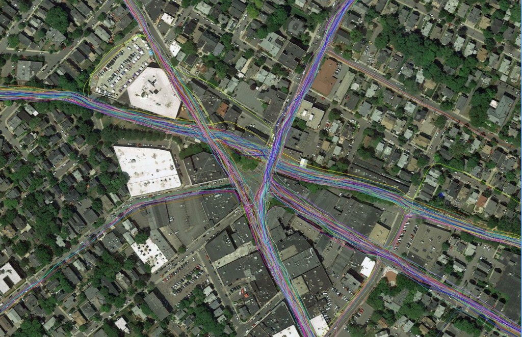
When I zoom in, some of the accuracy issues appear. Now, this isn’t a big deal. I am not using my GPS watch as a survey tool. Overall, I am very happy with the tracks.
The next step was to start to visualize and symbolize the tracks. Could I replicate the patterns I saw on the Nike+ website map using QGIS?
Yes. It was pretty easy. Because QGIS is awesome.
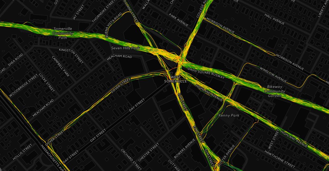
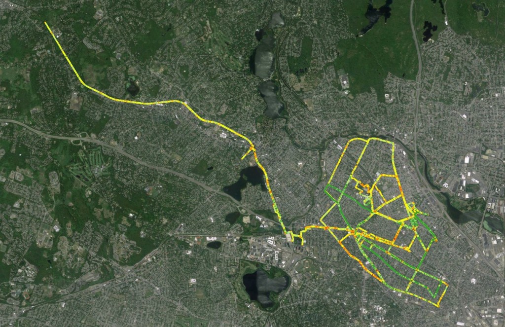
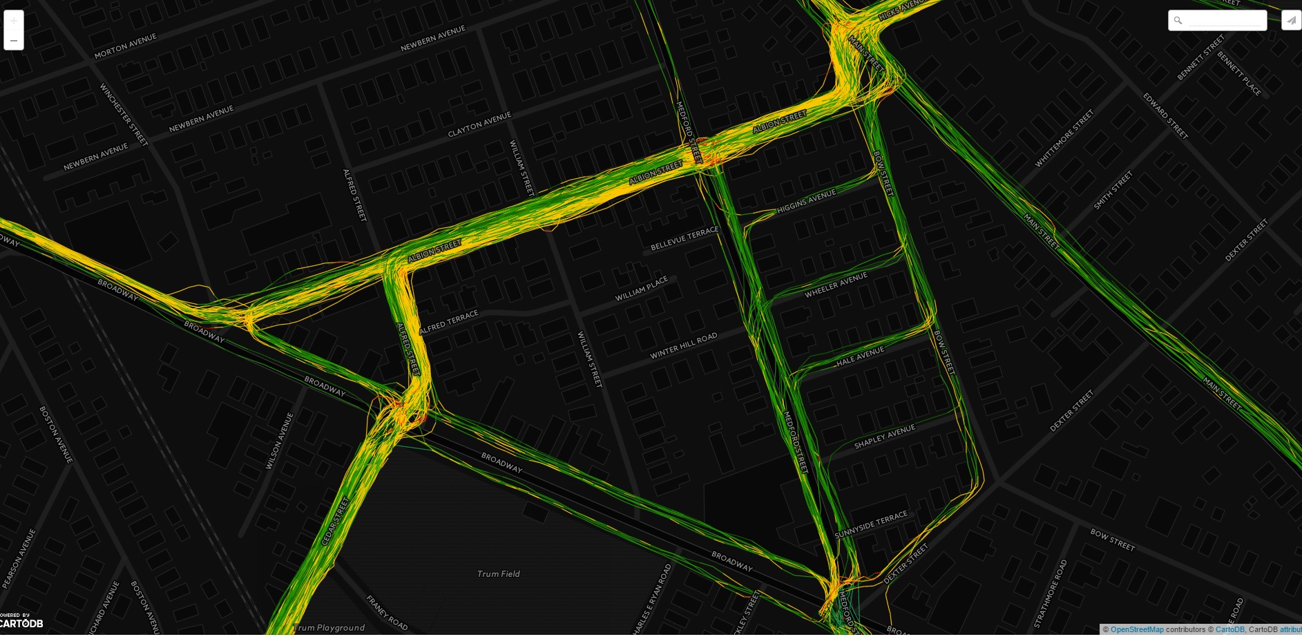
Using the meters per second data I calculated in the code, I symbolized it with a couple individual runs and then applied the defined breaks to all the datasets for a give year (using the mutliMQL plugin in QGIS) to get the following results. When I compare the color patterns to individual runs on my Nike+ account I get really good agreement.
Using CartoDB
I wanted to get some of this data into an online mapping tool. As you all know, there are a growing number of options for getting spatial data online. I went with CartoDB. I chose CartoDB because Andrew Hill bought pizza for an Avid Geo meet-up once and it was good pizza. Thanks Andrew!
There is a lot to like about CartoDB. The tools are easy to use and provided plenty of flexibility for this project. I am a fan of the available tools and I am looking forward to getting more into the service and seeing what else I can do during phase 2 of runBENrun.
2014 – I ran along Mass Ave into Boston a lot
2015 – Pretty much only ran on the Minuteman Parkway bike path and a bunch of Somerville/Cambridge/Medford loops
All the data is in I generated in the code is in these maps. I didn’t trim the datasets down to get them to work in the CartoDB tools. That was nice.
I really like this view of a bunch of my 2015 runs through Magoun and Ball Squares in Somerville/Medford.
What’s Next
The data processing isn’t over yet and there is a lot of things to do before I can actually call this project finished.
- With Rhys Anthony McCaig’s Nike+ exporter retired, I need to write some code to get my runs after January 2016.
- I need to start the real analysis. Get more into calculating stats that mean something to me, and will help me become a better runner (and geographer).
- Start expanding data visualization.
- I would also like to simplify the code so that I can run a single script.
- Run on every street in Somerville and South Medford!