Starting the 2017 Hubway Data Challenge

Time for a New Project 

A couple weeks ago, Hubway, Boston’s bike share service, announced their 2017 Data Challenge. For the challenge, Hubway is providing trip data for previous years, station data, as well access to real time data. Those who enter the challenge will build a wide variety of visualizations and analysis.  I think I might participate, so I downloaded the detailed month-by-month data for 2015 and 2016, as well as the station data and started to experiment.  This post will outline some of my early work before I actually figure out what I will (might) do for the challenge.

For those interested, submissions are due on April 10, 2017.

Making the Data Usable

Hubway provided the data in the only format that matters, csv files.  Since I don’t do much with text files (I am a database person), I wrote a few PostgreSQL scripts to wrangle the data from csv files into PostgreSQL.

The first script to I wrote was a loading script –  Hubway2017_loading.sql. The script is pretty simple. and does the following:

  • Build the tables – the schema is pretty straight forward
  • Load data into staging tables
  • Check for ‘bad values’ in each column – values that don’t meet the data type – they used a ‘\N’ for null. Make sure you check for that.
  • Load data into the final tables – I have each year in seperate tables.
  • Build geometry values for geographic analysis and visualization

The second set of scripts I wrote are analysis scripts.  To start with the data analysis, I wrote three simple analysis scripts:

Feel free to check out my github page for this project and grab whatever code you like.  I anticipate I will be adding more to this project over the next couple weeks.

Starting the Visualization

At the end of the Hubway2017_loading.sql script, I loaded the station data into its own table.  With that data, I created a GeoJSON file of the stations with the reported capacity value with QGIS.  I am using the GeoJSON format for a couple reasons.  It works more seamlessly with CARTO, and it can properly store a date value (something shapefiles don’t do well).

I have uploaded the dataset to my hubway github here.

For anyone who knows Boston/Somerville/Cambridge/Brookline, this pattern of stations will make sense.  The stations with lots of capacity stand out near South Station, MIT, and Mass General.  There are 187 stations in this dataset, however, I need to double check to make sure the stations that appear in the map below were actually in use during 2015/2016, as stations aren’t necessarily permanent.

The next visualization I wanted to make was a time series map displaying the daily starts across the entire system for 2016.  The first step was to build a table with all the relevant data.  For those interested in the script, check out the OriginsByDay_Hubway2016.sql script. Once the script was run and the data created, I built a GeoJSON file in QGIS and uploaded it into CARTO. CARTO is a great online mapping service that is easy to use. If you are looking to make some maps for this challenge and don’t want to spend a lot of time leaning how to map or use mapping specific software, I encourage you to check out CARTO.

The following map steps through each day, visualizing the number of trip starts using CARTO’s Torque feature.  It is fun to watch as the trip starts ebb and flow with the seasons.  One can see stations come in and out of service across the city throughout the year, see major peaks and valleys in usage, and observe the strong relationship in trip starts between downtown Boston and the outlying stations.

Click here for the full size version (that works much better than the version limited by my wordpress CSS).

This simple visualization has given me a number of ideas on what to look into next including:

  • Quantify the relationships between usage and weather
  • The Giver and Taker stations – what is the net usage by station for each day
  • Is that station at MIT really that busy every single day?
  • Relationships between population density and usage
  • Usage in regards to major days in the city, i.e., Marathon Monday, MIT/Harvard/BU move in days, college graduation days, Boston Calling, bad T days (for those who ride the T, you know what I mean).

There are some real patterns in this dataset and it will be fun to look into them and share the results.

Busiest Days in 2016

The last script I put together was to find the busiest days in regards to trip starts.  The busiest day was August 9, 2016, with 6949 starts.  This was a Tuesday, which blows my mind. I am shocked that the busiest day wasn’t a weekend day.

The rest of the busiest days all had over 6k starts and all happened between the end of June and the end of September.  And again, all were on weekdays.  This is really weird to me, as I tend to think that Hubway is used by tourists, and presumably, on weekends (especially downtown). Seeing that the busiest days are weekdays, is actually a real positive for the system, as it can be seen as a viable alternative transit option.

As you can see, there is still a ton to do.  I need to get into this data some more and start to plan the story I want to tell.  Also, I need to do some more QA on the data, so I fully understand what I am dealing with. The biggest part of any data analysis project isn’t the generation of fancy interactive graphics (which no one uses)  or writing ground breaking algorithms; it is the dirty data work.  Without checking and double checking the inputs, the analysis could be wrong, and no one wants that.


Racing Myself – Using Torque in CARTO with runBENrun

As most runners do, I run a lot of the same routes over, and over again. During a run yesterday, I had the idea that I could pull all my runs on my three mile loop and race them against each other using CARTO‘s Torque feature.  It took a little bit of data prep to get my GPS data into a format to “race itself”, but I will spare the technical details for later.

Here are 25 separate runs I ran from 2016 on my Somerville 3 mile loop.  Each point is the lead GPS point of an individual run, with time steps synced, visualized by meters per second speed. To see the full size, click here (it is much better in full size).


Couple points about the race

  • Winner – 10/11/2016 – 3.13 miles, 19:10 time,6:07 pace
  • Loser – 12/12/2016 – 3.13 miles, 24:26, 7:48 pace
  • There are a few deviations on the route, especially at the end.  This is because of number of factors, either because I made a different turn or had to run a little longer to get the required distance due to GPS errors earlier in the run.
  • I am able to race myself because the data I generate with runBENrun project uses elapsed time, so I am able to compare run against run.
  • I used a Nike+ watch, and scraped the data into my own environment using Smashruntapiriik, and my own code.
  • The very last point to leave the map is a run where I didn’t turn off my watch at the end and walked into my house!

Here is How I Created the Race

Warning – Technical Details Ahead! Ahh Yeah!

In 2016, I ran my Somerville loop 25 times.  It’s a pretty flat and fast course, that has a good long straightaway down the bike path, but it does have a couple tight turns and pauses waiting for traffic to cross Broadway.

I run this loop in many different phases of training periods.  Sometimes I try to run fast on this loop, but other times I am using this course for a recovery run. As I was preparing the data I thought my pace and times would be all over the place.

First step was to run a query against all of my 2016 runs to find all three mile runs, that where not classified as interval runs (github here). The script returns any run that rounds to three miles. So I had to do some post processing.

The query returned 42 three mile runs in 2016.  The next step was to pull all of the shapefiles I generated for these datasets a while back (code here!) and check the routes using QGIS. I removed a number of races I ran, and a few three mile runs that weren’t along this route. Once the set was cleaned, I ended up with following 25 runs.

You will notice that the routes don’t all follow the same path.  In fact, I often end at different places on different streets.  This is for a couple reasons: I may have to run a little extra at an end of a run due to pauses in my GPS, or I took a turn a little early toward the end of the run down and I had to make up the distance at the end. Overall, the 25 runs represent a pretty consistent route.

Querying my runBENrun database, I can get my stats for the 25 runs, and checkout how consistent, or inconsistent, I am on this route (github here). The spread of times isn’t too bad, so it should show a decent race.

From here, I wrote a script to create a postgreSQL table with all the relevant runs from the master GPS point table for 2016 (github here).  I made sure to cast the finaltimecounter column as time so that I could use it in CARTO later on.

The output table contains over 29k points, as seen below.  This dataset is what I need to use in CARTO for the animation using Torque.  Using QGIS, I exported the dataset  as a GEOJSON.  Why GEOJSON? Because I had a time field and shapefiles don’t play nice with time data.

I imported the GEOJSON dataset into CARTO and then used the following settings in the Torque Cat wizard.  I found the following settings gave the best view of the “race.” CARTO is super easy to use, and the Torque Cat tool provided a lot of options to make the map look really sharp.

In the end, I got a nice map showing me race myself.  I have a few ideas on how to improve the map and data, but that will be for another time.

Thanks for reading.

The Best Way to Map a Run

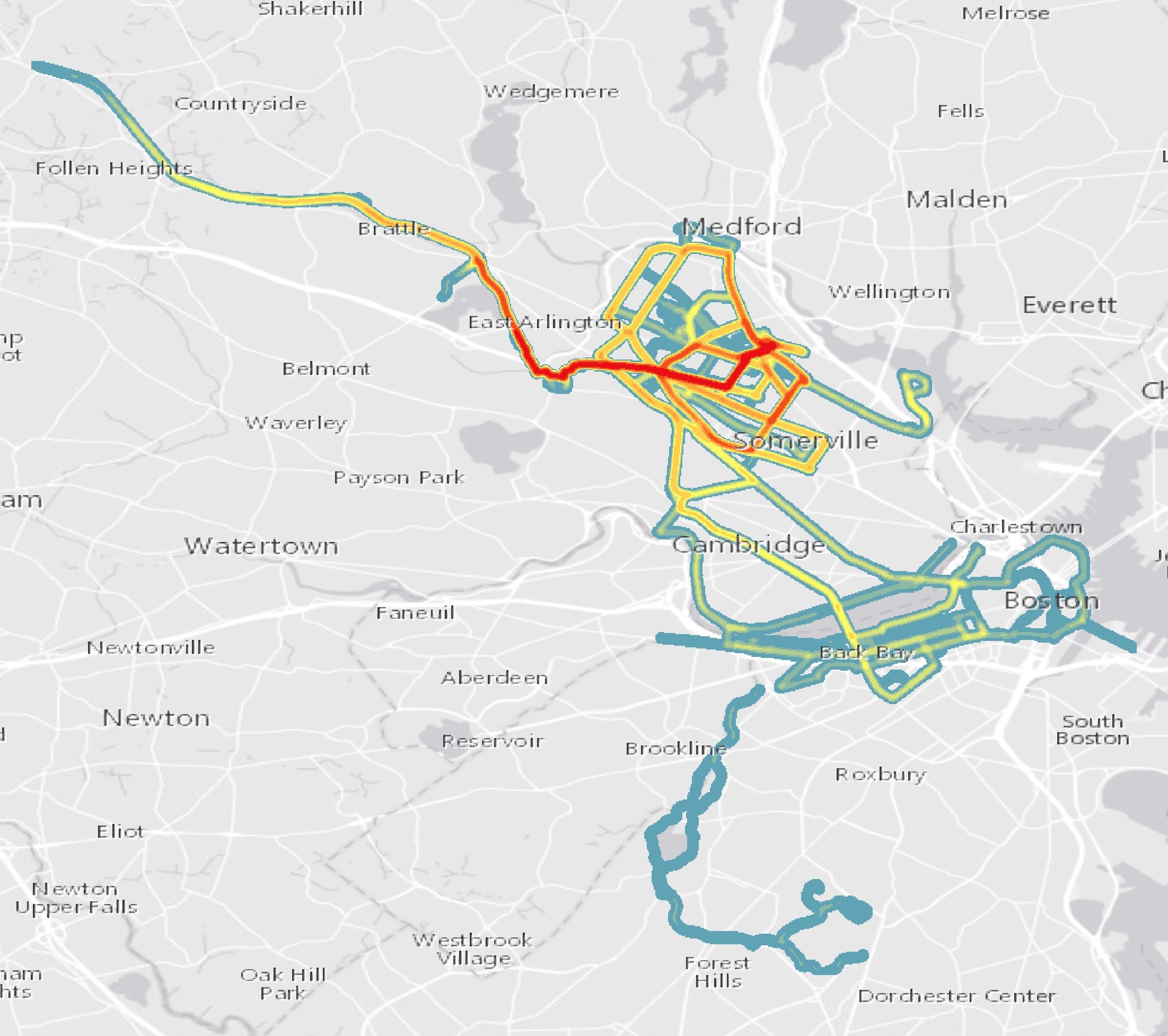
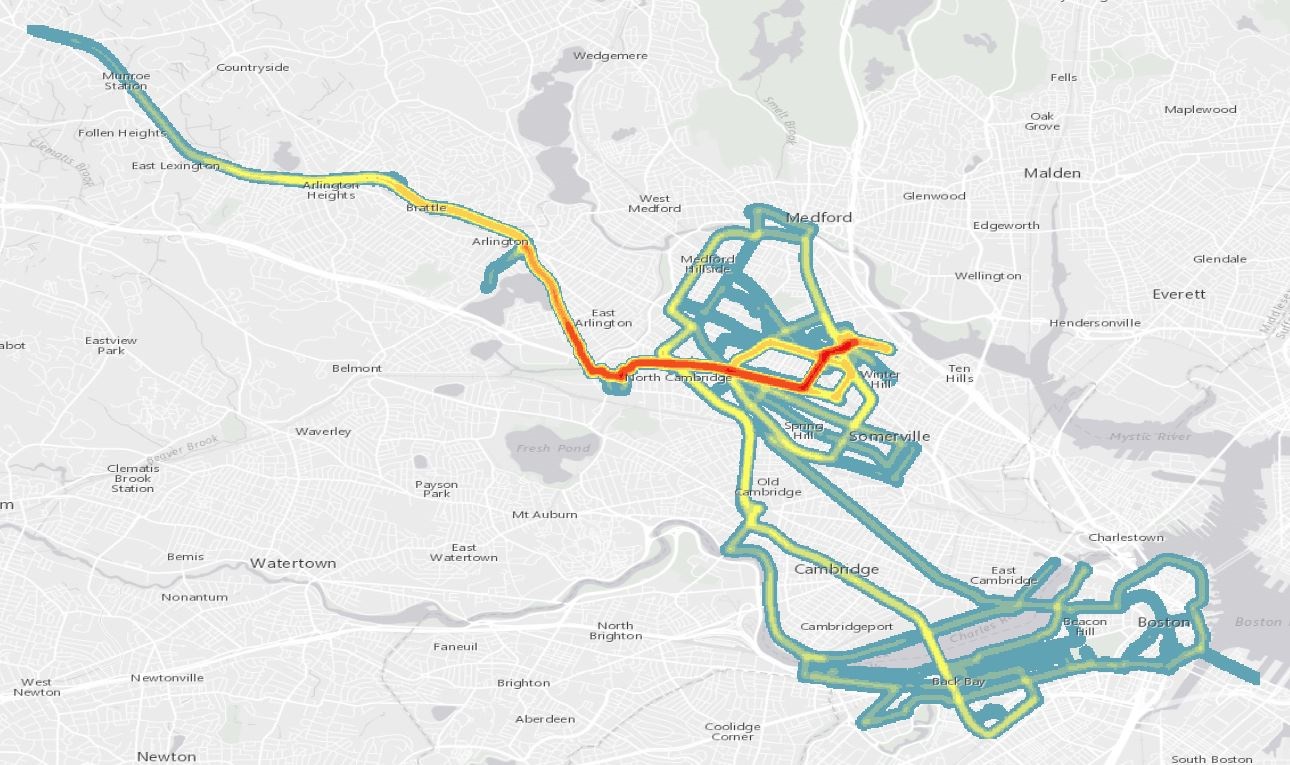
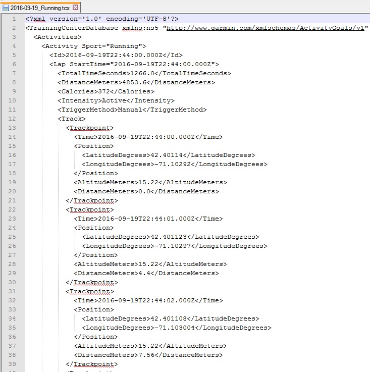
From my runBENrun project I have generated a lot of data; over 1.2 million data points in 2.75 years.  It is easy enough to write SQL scripts to analyze the data and gain insight into the runs, however, trying to build meaningful maps that help me interpret my runs isn’t as easy.  I have made plenty of maps of my running data over the past year, some good, some bad. In this post, I will explore a few different methods on how to best visualize a single 5k race dataset from my runBENrun project.

The Problem

With most GPS running apps and fitness trackers, you are often generating lots and lots of data.  My old Nike+ watch collects a point every ~0.97 seconds.  That means if you run a six minute mile in a 5k you can log over a 1000 points during the run.  The GPS data collected by my Nike+ watch is great, and I can generate lots of additional derivative attributes from it, but is all that data necessary when trying to spatially understand the ebbs and flows of the run?

Software

I will be using PostgreSQL/PostGIS, QGIS and CARTO in this project. In my maps, I am using Stamen’s Toner Light basemap.

The Data

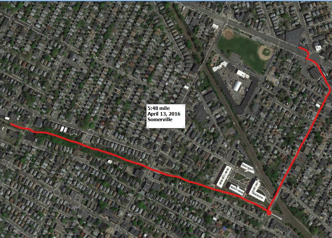
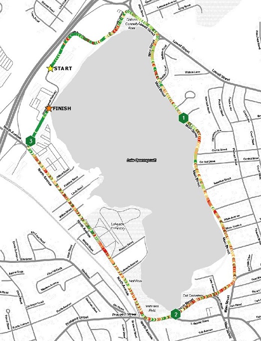
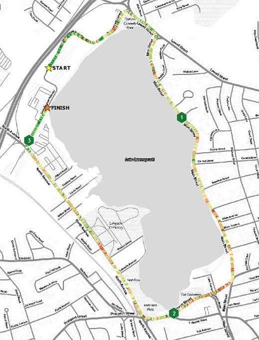
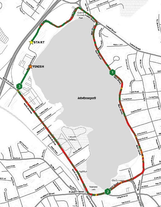
For this post, I am using a single 5k race I ran in November 2016, in Wakefield, Massachusetts.  The race course loops around Lake Quannapowitt, and is flat and fast with several good long straightaways, and some gentle curves.  I’ve run a couple races on this course, and I recommend it to anyone looking for a good course to try to PR on.  I am also selecting this dataset because the course is a loop, not an out-and-back.  Out-and-back running datasets are a lot harder to visualize since the data often interferes with itself.  I plan on doing a post about visualizing out-and-back runs sometime in the near future.

In case anyone is interested, I have exported a point shapefile and a multiline shapefile of this data, which can be found on my github account.

Before We Starting Mapping…

What’s spatially important to know about this run?  Beyond mile markers, speed is what I am most interested in.  More importantly, how consistent is my speed throughout the run.  I will add mile markers and the Start/Finish to the maps to give some perspective. I will also provide histograms from QGIS of the value and classification breakdowns to help give context to the map.

Let’s Make a Lot of Maps of One Run 

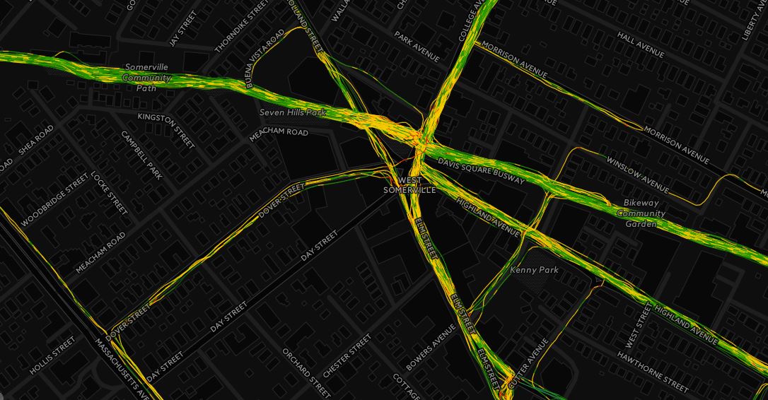
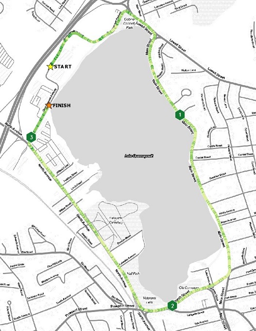
Mapping all 1,117 Points – Let’s start with a simple map. When only visualizing the points I get a map of where I was when I ran. Taking a point about every second, the GPS data isn’t very clear at this scale.
AllPoints Is this a good running map?  No.

Mapping Meters Per Second Bins using Point Data

Points on a map don’t tell us much, especially when the goal here is understand speed throughout the race. The next step in this project is to visualize the range of values in the Meters per Second (MpS) field.  This is a value I calculate in my runBENrun scripts.  The next set of maps will take a couple different approaches to mapping this point data, including visualizing the MpS data by quantile, natural, and user defined breaks.
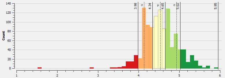
Quantile Breaks

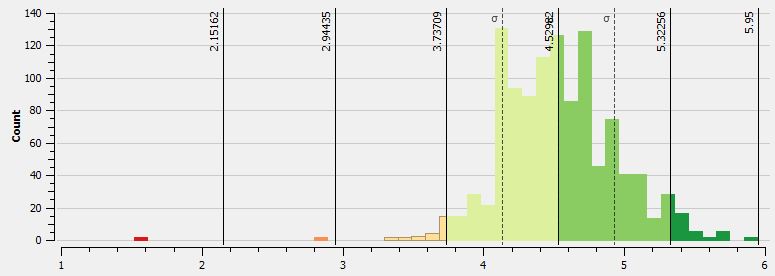
The first MpS map uses quantile breaks to classify the data.  Since there is a tight distribution of values, quantile breaks will work (there are no major outliers in the dataset). In the following histogram from QGIS we see the distribution of values coded to the five classes.  In all of the maps green equals faster speeds while red values are slower.

QuantileBreaks_MpSHistogram

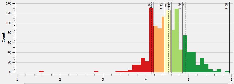
The map displays the points classified as such.  What’s important to note from the point based map, is that since there are so many points in such a tight space, that seeing some type of meaningful pattern is tough.  To the naked eye there are many “ups and downs” in the data.  There are clear sections of the race where I am faster than others, but in other parts of the race a “slow” point is adjacent to a “fast” point.  This pattern will show up in the next maps as well.  I am looking into this noise and will hopefully have a post about understanding this type of variation in the GPS data.

Points_QuantileBreaks

Is this a good running map? Not really.  The data is busy; there are too many points to get a real perspective on how consistent the speed was.
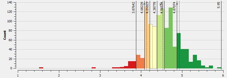
Natural Breaks

The next map uses natural breaks classification scheme.  When comparing the histogram using quantile breaks to the natural breaks, one will see that natural breaks algorithm puts fewer values into the lowest (or slowest) bin.
NaturalBreaks_MpSHistogram

The difference in binning is apparent in the map.  Overall, the reader is given the impression that this is a better run, since there is more non-red colors on the map. Without a MpS legend one wouldn’t know one run was faster than the other. Overall, the general speed patterns are better represented here, as I believe there is a better bins transition between the bins.

Points_NaturalBreaks

Is this a good running map? It’s better.  The natural breaks classification works better than quantile breaks with this dataset, but there is still too much noise in the dataset. That noise won’t be eliminated until the dataset is smoothed.

 Self Defined Classification – Ben Breaks

In this example, I wanted to set my own classification scheme, to create more friendly bins to the “faster” times.  I call this classification scheme the “Confidence Booster.”

BenBreaks_MpSHistogram

One can see that I have larger bins for the faster speeds, and really minimize the red, or slower bins.  The resulting map has a smoother feel, but again, there is too much noise between the MpS values from point to point.

Points_BenBreaks

Is this a good running map?  It’s not bad, but as with all the point maps, there is a lot of data to communicate, and at this scale it doesn’t work as well as I would have liked.

Overall, the point data, using every point in the dataset isn’t a good approach for mapping the run.

Mapping Multiline Data

Using my runBENrun scripts, I generated not only point geometries, but also multiline geometries (single line calculated between each sequential point).  At the scale we are viewing these maps, their isn’t much visual difference between the point and line maps, which is understandable.  The multiline datasets are much better utilized when one wants to zoom into a specific area or see the actual details of the route.

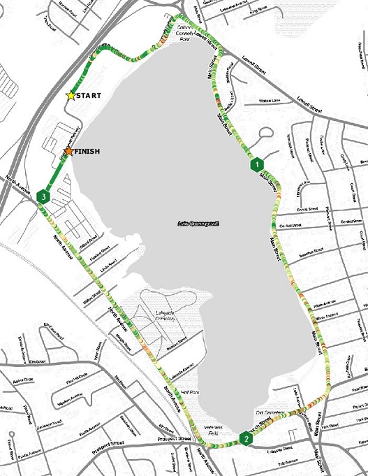
I generated the same set of maps using the multiline based data as I did with the points, so I won’t repeat the maps here. However, I will share a map of the multiline data loaded into CARTO, symbolizing the MpS value with the multiline data using a natural breaks classification.

Is this a good running map?  Yes and No. The line data symbolized with natural, quantile, or self-defined breaks works better in an interactive setting where the user can pan and zoom around the dataset. However, the static versions of these maps have the same issues the point data maps do.

Mapping Multiline Data Aggregated to Tenth and Quarter Mile Segments

For this dataset (and almost all running datasets), visualizing every point in the dataset, or every line between every point in the dataset isn’t a good idea.  How about we try a few methods to look at the data differently.  The first approach is to smooth and aggregate the data into quarter mile and tenth of a mile segments.

Using PostGIS, I simply aggregated the geometry based the distance data in the table, and then found the average MpS for that span.  I wrote the output to a table and visualized in QGIS.

Quarter Mile Segments – Quantile Breaks

Since there is less data to visualize, we get a much cleaner, albeit, dumbed down version of the race.  There are clear patterns where I was faster than where I was slower (green=fast, red = slow, relatively speaking).  The consumer of the map isn’t wondering why there was so much variation.  I made this map with both natural breaks and my self-defined breaks, but the quantile classification gave the best view of the race.

QuarterMile_QuantileBreaks

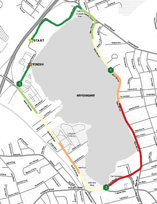
Is this a good running map?  Yes, if you just want to know the general trends of how your race went, then this map will let you know that. My second mile, as always, was my worst mile. I traditionally struggle in mile two.

One Tenth Mile Segements – Quantile Breaks

How about comparing different aggregation approaches?  Let’s look at the race broken into tenth of a mile segments using a quantile classification scheme.  In this approach, there is more detail in MpS differences during the race than the quarter mile map. The color for the middle bin does get washed out in the map, so I should probably go back and fix that.

TenthMile_QuantileBreaks

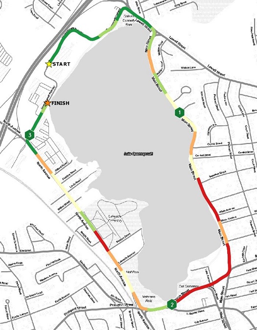
Is this a good running map?  Yes.  The general message – where was I fast and where was I slow – is answered and the data isn’t distracting, like it is in the point maps.  A way to improve this visualization would be to add the actual breaks between tenth mile segments, and maybe a table with the time splits.

Using Standard Deviation and Average Bins

The last set of maps will visualize the race using some basic statistical measures – standard deviation and average.

Standard Deviation

The distribution of values are fairly compact.  The resulting maps using the standard deviation bins reflect that.
StandardDev_MpSHistogram

With the point dataset, MpS values classified using standard deviation, you actually get a pretty decent looking map.  Since there are so few very fast or very slow MpS values, you don’t get many points in those bins extreme bins. This means that the color ranges fall more in the middle of the range. This map won’t tell you have fast or slow you were really going, but it gives you an idea of how well your run was relative to the rest of the race.  For what I plan to do in a race, I would hope to see a majority of values in the +1 or -1 standard deviation bins.  This would mean that I was pretty consistent in my MpS.  Ideally, I would also see values in the higher plus standard deviation bins towards the end of the race, as I really try to pick up the pace.

Points_StandardDev

Is this a good running map? If you know what you are looking at, then this map can tell you a lot about your run.  However, if you aren’t familiar with what a standard deviation is, or how it is mapped, then this might not be a good approach.

Average Values

The last map for this post is simply mapping those points that are above, at, or below the average MpS for the race.  In this race, my average MpS was 4.52 (For reference, Mo Farah won the 2016 Olympic 5k in 13:03, or 6.39 MpS!).  I created three classes – green – points with an above average MpS, yellow – points that were average, and red – points that had a below average MpS. The view of the run isn’t that bad with this approach.  The user get a fairly clear indication of relative speed during the race, without all the noise from previous attempts to classify the data.  Using the average value here though only works because the range of values is fairly tight.  If there was a wider swing in values, this approach might not work.
Points_Averages

Is this a good running map? Yeah, it’s not that bad. The colors are a little harsh. In this case it works, but depending on the range of values, mapping compared to the average may not work. Another test would be to compare values against the median.

What map was the best approach?

In the end, what map was the best approach to visualizing the data from the race with the goal of best understanding my MpS?  I had two maps that I think met the requirements:

  • Quarter Mile Segement Quantile Breaks – smooth transitions between classes, easy to view, and informed readers of the general race speed trends
  • Standard Deviation – good approach if you know what a standard deviation is, and if your data is compact (don’t have huge swings in value).  This approach gives the reader a clear indication of how they were doing relative to the rest of the run, without worrying about the individual MpS values.

There is value in all the maps, and with a little work, they could be improved as well. However, these two maps were my picks.

What’s Next?

I actually made another 10 or so maps when working on this blog, including maps using proportional symbols, incorporating more data smoothing, and some ideas about flow maps.  The next steps will include exploring those visualization methods with the goal of getting them into the blog.

Have any other suggestions? Send me a note on twitter @thebenspaulding!

runBenrun – These aren’t Heat Maps

I’ve gone back into my running data from 2014 and 2015 to build some density maps to compare to what I have run so far in 2016. Building a 10m grid for the region, I did some simple aggregations based on the GPS points captured by my Nike+ watch and processed through my runBENrun project (see it here on github).

These aren’t heat maps.  These are simple density maps.  There is a difference.

<start rant>

Please stop calling every single choropleth map a heat map.

</end rant>

From my running data, I can see some pretty clear patterns in where I ran.  In 2014, I kept my runs in Winter Hill, but ventured out into Cambridge and Boston a few times. A couple races in Boston show up, but the blue color range is only for a couple points per pixel.

2014 Run Density
2014 Run Density

In 2015, I changed the geography of my runs. I stopped with my Winter Hill routes and went out to the Minuteman Bikeway, venturing out as far as Lexington. The darker reds indicate where most of my runs were. Again, a race in Boston stands out as a single run, as do a couple runs into Medford and the southern reaches of Somerville.

2015 Run Density
2015 Run Density

My 2016 run density map to date is much different than the previous two years.  Firstly, I have put on a lot more miles this year than in past years, but almost all my miles were on the Minuteman Bikeway! I did run quite a bit into Cambrigde and Boston, mostly on my long Sunday runs as I prepared for my marathon. Like 2015, a vast majority of my runs were in Somerville and Medford, along the bike path.

2016 Run Density
2016 Run Density

When I combine all years I get a view of my running history that I have developed quite the habit for running close to home! The runs along the Minuteman Bikeway radiate red, as I have logged hundreds of miles along the route over the past couple years.  Even my adventures into Cambridge and Boston start to stand out, as I tend to use the same routes down Mass Ave, Boylston Street, and back into Somerville and Medford along Broadway in Cambridge.

All Run Density Map
All Run Density Map

This exercise didn’t reveal anything new to me, but it was a good exercise in thinking about different ways to display the data collected from my Nike+ watch through my runBENrun project.

runBENrun Part 3 – Starting with PostgreSQL and Running Analysis

Kernel Density Analysis Performed in ArcGIS
Red – more runs – Blue – less runs

Run Ben, Run! Data Analysis!

Finally! I am at a point with my Nike+ app data transformation process from the raw TCX files to data I can work with.  It is now time to now build the data foundation for further analysis. For this phase of the project I decided take all the run data created in my text parsing code and load it into a PostgreSQL database.  I work with SQL scripts all the time, but professionally I work in a Microsoft environment, so it is nice to branch out and work with PostgreSQL.

The biggest PostgreSQL challenge I ran into was remembering to add the semicolon to the end of all my queries!  Otherwise, any other difference in syntax/code editors/software between Transact SQL and PostgreSQL/PostGIS were easy to learn.

The first step was to design and build a simple database to store the data.  The database is built around three tables:

  • rbr_AllRuns_2016_Points – table where I upload the points and attribute data built in the TCXtoText.py script. The  table will also store the geometry point objects and the geometry line segments between each point for a given run. To tie the individual runs to other tables I added a runid field, which was added to the input dataset in the TCXtoText.py script.
  • rbr_AllRuns_2016_ID – table where each run’s characteristics are stored, including date, runid, descriptive info about the run, total time, average pace, fastest mile in minutes,  and the fastest mile (which mile in the run).
  • rbr_AllRuns_2016_MileSplits – table that stores the runid, mile marker, and time (in minutes) I completed that specific mile.  The time data was calculated in the TCXtoText.py script and imported into the rbr_AllRuns_2016_Points table.

There are also several “temp” tables that are built to support the three main tables.  These tables were built to clean values, generate the line geometries, add the mile markers, and mile splits.  I call these “temp” tables, but I wrote them all to the database.  There only “temp” in the sense that I won’t use them (probably) for analysis.  Everything I need from them is in the main tables.

The code for to generate the required tables and populate the necessary data can be found on my github account – rBr_ProcessNikeGPSData.sql 

If you check my code on github, my table naming isn’t very consistent for these temp tables.  I will clean it up.

Early Analysis Results

I have started thinking about the analysis I want to start to build and I have played with a few ideas.  Some early queries have included classifying my runs by distance and speed, finding my fastest and slowest miles, and comparing mile splits across runs and distances.

  • To this point in 2016, my GPS has logged 219 runs and 442,174 GPS points, which account for 117 hours, 39 minutes and 14 seconds of running and 1126.78 miles. My marathon, for whatever reason, won’t export out of Nike+.
  • The 442,174 GPS points sometimes create interesting patterns.  For example, when zoomed into a street where I run every day, I get an interesting stripping of points. Without seeing the individual runs, it is tough to see if this is just noise or a real pattern. I know my GPS takes a reading every 0.97 seconds. Since I run the same routes so much, I believe the pattern gets amplified, creating the striping. It’s neat to see.

pointsample

  • Not tracked in my data – the three pairs of running shoes I have gone through this year. Adidas Supernova Sequence.
  • I built a Run Type field in my ID table, where I pseudo categorize my runs by distance and speed.  This categorization needs work, but so far I have more Awesome runs and Ehh runs. I’ll post the details on how I categorize these runs later.

Run Type

Total Runs

OK 83
Intervals 59
Awesome 34
Great 33
Ehh 10
  • My fastest mile that I ran that wasn’t in a race or during intervals was on April 13 at a 5:48 pace, cruising down the bike path in Somerville.

fastestmile

  • My slowest mile was on July 31 at an 8:08 pace, but I didn’t map that!

What’s Next

Now that I have my data in a format that I can quickly query the deeper analysis will now follow.  There are some data cleaning steps I need to add in during the loading process (like how to deal with pauses and breaks in the GPS data) and refining how I measure distance.

Feel free to check out the code on github and shoot me any suggestions/comments/ideas through twitter @GISDoctor.

runBenrun – Part 2 – The World of Changing Data Formats

It has been a while between posts…I was busy running.

When I started this project I anticipated that there would be changes I would have to adjust to along the way. For example, I knew the tool I was using to extract my running data from Nike+ was being retired and that I was either going to have to write my own extraction tool or find a new one.

At this point of the project, I wasn’t ready to work with the Nike+ API, so I went and found another app that allowed me to simply login and pull my data from what I have uploaded from my GPS watch.  I decided to use Tapiriik, which allowed me to sync my Smashrun account to Dropbox.  The nice thing about using Tapiriik is that the run data is written to my Dropbox account automatically, so that the data is almost immediately accessible.  In reality, relying on 4 different apps to get my data isn’t a good idea.  Ideally I should pull my data from my Nike+ account directly, but for now this alternative works.

TCX?

However, there was a change in the output run data using the process described above. The data delivered by Tapiriik from Smashrun to my Dropbox account was in the form of a TCX file.  TCX files in the GIS world aren’t that common, meaning there aren’t many out-of-the-box tools in typical GIS software to handle them.  The TCX is an XML based format developed by Garmin to store the typical data found in a GPX file, with additional information about the activity type.  If you dig around the internet, you can find the TCX schema here.

Example TCX from Smashrun/Dropbox sync

Let’s Write Some Code

To get the TCX data into a usable format, I had to rewrite some of my parsing code (available on my GitHub account!), and search for additional python snippets to handle the TCX format. The TCXtoShape.py script is now up on my GithHub and handles this elusive format.

The script uses code I found on GitHub from JHofman. His fitnesshacks project has some good TCX parsing that I incorporated to build my input lists of points from the TCX file.

The TCXtoShape.py script works in a very similar fashion as the UpdateGPXdata.py script from the first phase of my project:

  • Parse the input TCX data
  • Create an input list for each run
  • Create the various distance/speed/time measures needed for future analysis
  • Build a line shapefile for each run with the attributes

I should figure out how to embed some code in this post…

Maps!

Using the TCXtoShape.py  script, I reran all my runs from 2016 into a new set of shapefiles (206 so far). The output for the shapefile schemas between the different scripts, TCXtoShape and UpdateGPXdata.py, output he same formats, which will be good for when I build analysis tools. Using QGIS I have done a few quick visualizations to make sure the data looks good, but nothing fancy yet.

All Runs Through September
All 2016 Runs Through September, 2016

I calculate meters per second in the code, which can be visualized pretty easily in QGIS.

2016 Boston Runs, Visualized by Speed

Next up, I need to start developing the analysis to understand what all this is saying.  But for now, I’ll just appreciate the data.

runBENrun – Part 1- It’s All About the Data

In 2016 I set a big goal for myself; get better at what I do. That includes geo-stuff, fitness stuff, personal stuff, and tech stuff.  It’s spring time, so now is a good time to start another project.

I run. I run a lot. I also like data, maps, and analysis.  I’ve been running for many years, but only since May 2014 did I start to use a GPS watch and track my runs through an app.  I run with a TomTom Nike+ GPS sports watch.  It has been a good sports watch. It is not as feature-rich as some of the new sport watches on the market, but it has a bunch of features not available in lower cost models. Having this watch is great, but that’s not the point of this project.  This isn’t a watch review. This is a geo-nerd running man project.

I am calling this project runBENrun.  The goal of the project is to get my data out of the Nike+ system and into my own hands, where I can analyze and visualize how I want to.

The first phase of this project will cover the data acquisition, cleaning, and early visualization testing – all with a geo/maps/GIS focus.  Over the course of the next few months, there will be other posts about additional analysis,code, and visualization I take on with this very awesome geo-data.

All of the scripts I am putting together will be on my now back-from-the-dead github account. Feel free to check them out!

The Problem

One of the benefits of buying Nike’s watch, is that you get to use their website (update – Nike updated their site in early June 2016, so the screengrabs below are out of date, but the general idea is the same), where one can upload their workouts and see a number of pretty basic running stats like average speed, total time, miles run, and a choropleth map of the run. It’s not a heat map. Don’t call it a heat map. One can also view their previous runs and there are a number of milestones and badges that users can earn for any number of achievements.

Screen grab of my 4/10/16 run
Screen grab of my 4/10/16 run – Overall, the Nike+ site is a pretty good free app

The app has been good, again, for a free service. I don’t complain about free.  But, as I started getting more and more serious about my workouts, training for races, and improving speeds, the app only helped so much.  I knew what I wanted to analyze the data more in depth.

The Goal

Beyond opening my data and getting insight from hundreds of runs and thousands of miles, I want to expand and improve on a number of my geo-skils.  I want to use a few python libraries I hadn’t explored before, get into more Postgres scripting and geo-analysis, and then really improve my web vis skills, since I haven’t done any web stuff in a long, long time.

Let’s get started.

Data, Data, Data

The first step in this project is to collect all my running data.  When I started working on this project it was mid-February and I had over 300 runs stored in my Nike+ account.  Unfortunately, Nike+ doesn’t have a quick export feature. I can’t just go and click a button in my account and say “export all runs”, which is a bummer.

Nike+ does has an API to collect data from the site, but I didn’t use it in this phase of the project.  I used the since retired, Nike+ Data Exporter, a free tool provided for by Rhys Anthony McCaig. It was easy to use and provided easy to parse zipped GPX files. Overall, all of my run data was about a 100mb. I will eventually build my own tool to pull my run data from my Nike+ account.

Python is the Best

Once all the data was downloaded I needed to start processing the data. For this project, I decided to use the only language that matters: Python.  I built a few scripts to process the data and start the analysis. The links here go to the gitbhub links for each script.

Parse GPX to Text File

  • Rhys McCaig’s script returned GPX files and I had hundreds of them to parse through.  This simple script uses the gpxpy library, with code assistance from urschrei’s script, the script converts the data from the GPX format to a flat text file for all files in directory.

Rename the Files

  • Quick script to loop through all the datasets and give them names that made sense to me. It’s pretty simple.

Update the GPX Data

  • The Update GPX Data script with where the magic happens, as most of the geo-processing happen here.  The following points out some of the scripts highlights. Check out the code in github for all the details.
    • Uses a three specialized spatial python libraries, including fiona, pyproj, and shapely.
    • The script uses every other point to generate the lines and for speed and distance calculation. Using every other point saved on processing time and output file size, without distorting accuracy too much.
    • Manipulating dates and times
    • Calculating stats – average pace, meters per second, distance (meters, feet, miles). Meters per second is used in the visualization later on.
    • Shapely is used to process the spatial data.
    • Fiona is used to read and write the shapefiles files. I built a shapefile for each run.
    • Pyproj is used to change the coordinate system to make proper measurements between points.
    • If you are a geo-person I highly recommend checking out Shapely, Fiona and Pyproj.

The Results

I’ve run my code on my backlog of data.  Here are a few things I have learned so far.

  • Number of Data Points – The Nike+ watch stores a point every ~0.96 seconds, so my average run (6 miles) logged about 5,000 points. When I process the data, I only kept every other point in the final shapefiles, but I did keep all the data points in the raw output. If I end up storing the data in a single table in PostgreSQL later on, I will need to think about the volume of data I will be generating.
  • Number Links – For a ten mile run in January, my output shapefile had over 2,300 links, which is very manageable.
  • Run Time – Most of the time I am in the “let’s make it work” and not the “let’s optimize this code”.  Right now this code is definitely “let’s make it work”, and I am sure the python run times, which aren’t bad (a couple minutes max) can be improved.
  • Data Accuracy – With the visualization tests, so far, I am pretty happy with using every other point.  With a personal GPS device, I expect some registration error, so if my run is exactly on a given sidewalk or road.  For this project, “close enough” works great.

Early Visualization Tests

Once all the data was processed and the shapefiles were generated (I’ll get some geojson generation code to the project next), I pulled them all into QGIS to see what I had.   At first I just wanted to look at positional accuracy. Since I am only using every other point, I know I am going to loose some detail. When zoomed out most maps look really, really good.

All Runs through Davis Square
All runs through Davis Square

When I zoom in, some of the accuracy issues appear.  Now, this isn’t a big deal.  I am not using my GPS watch as a survey tool. Overall,  I am very happy with the tracks.

Accuracy with Ever Other Point from GPS output
Accuracy with every other point from GPS output – 2015 runs

The next step was to start to visualize and symbolize the tracks. Could I replicate the patterns I saw on the Nike+ website map using QGIS?

Yes. It was pretty easy. Because QGIS is awesome.

Using the meters per second data I calculated in the code, I symbolized it with a couple individual runs and then applied the defined breaks to all the datasets for a give year (using the mutliMQL plugin in QGIS) to get the following results.  When I compare the color patterns to individual runs on my Nike+ account I get really good agreement.

Using QGIS to visualize all 2015 data

Using CartoDB

I wanted to get some of this data into an online mapping tool. As you all know, there are a growing number of options for getting spatial data online.  I went with CartoDB.  I chose CartoDB because Andrew Hill bought pizza for an Avid Geo meet-up once and it was good pizza.  Thanks Andrew!

There is a lot to like about CartoDB.  The tools are easy to use and provided plenty of flexibility for this project.  I am a fan of the available tools and I am looking forward to getting more into the service and seeing what else I can do during phase 2 of runBENrun.


2014 – I ran along Mass Ave into Boston a lot


2015 – Pretty much only ran on the Minuteman Parkway bike path and a bunch of Somerville/Cambridge/Medford loops

All the data is in I generated in the code is in these maps.  I didn’t trim the datasets down to get them to work in the CartoDB tools. That was nice.

I really like this view of a bunch of my 2015 runs through Magoun and Ball Squares in Somerville/Medford.

I guess I don't like running down Shapely Ave!
I guess I don’t like running down Shapley Ave!

What’s Next

The data processing isn’t over yet and there is a lot of things to do before I can actually call this project finished.

  • With Rhys Anthony McCaig’s Nike+ exporter retired, I need to write some code to get my runs after January 2016.
  • I need to start the real analysis.  Get more into calculating stats that mean something to me, and will help me become a better runner (and geographer).
  • Start expanding data visualization.
  • I would also like to simplify the code so that I can run a single script.
  • Run on every street in Somerville and South Medford!

Some Quick Maps about the Green Line Extension

Recently, two State of Massachusetts transportation boards recently voted to approve the long awaited Green Line extension (maybe, hopefully, we’ll see, also the Feds are OK with the new plan).  This is huge news, especially if you are an avid transit user, like I am.  In the nearly six years I have worked in Back Bay and lived in Winter Hill I have never driven to work, relying on the bus network, and orange and red lines. The Green Line extension, for all it’s faults,  is going to improve transit options for one of the most densely populated areas in not only the Boston region, but the entire country.

Being the armchair geographer I am, I wanted to take a quick glance at how the population in this relatively small area compared to other populations in Massachusetts using open data and open source software. According to the 2010 census, nearly 73,000 people (including me!) live within a half mile of a proposed station. The extension will run through several densely populated neighborhoods, originating from Lechmere in Cambridge and branching into two lines; one terminating at Tufts University at the College Avenue stop, and the other ending in Union Square.

Let’s put those tightly packed 72,000+ people into perspective. With maps!

GreenLinePop2

There are more people in this area than these 63 towns.

StatePop1

or these nine towns:

StatePop2

or these 22 towns:

StatePop3

No matter how you cut it, the Green Line Extension impacts a lot of people and will be a transformative project for the region.

How I made the maps

I used QGIS Essen to build the buffers and plot the stations.  The boundary data came from MassGIS, including the 2010 census block dataset, and town dataset. For the background map, I used Stamen’s toner basemap.  To confirm the population estimate, I used information from the Green Line Extension Project Environmental Assessment and Section 4(f) Evaluation (table 6.15-1)

Spatial SQL for the Geographer now on GitHub

A long time ago, in an apartment up the street, I put together a bunch of blog posts with simple examples of using Microsoft SQL for spatial data. Those blogs, aptly titled, Spatial SQL for the Geographer, still get a good amount of hits five years after they were originally posted.

Knowing that these old blogs still get traffic, I wanted to modernize them a little bit.  As with all my 2016 projects, I wanted to do something I hadn’t done before, or improve a skill.  So for this project, I moved all the scripts from the blog posts into my GitHub account:

github.com/bspauld/SpatialSQLfortheGeographer

The code is now much more accessible and not buried in the text of a blog post, which is really why I wanted to get them into GitHub.

The ReadMe has links to all the original blog posts. Those posts give an in-depth look into how the scripts work, references to MSDN documentation, and links to the original sample data download. I wanted to make sure this is still relevant, so I have tested the data and scripts though Microsoft SQL 2014 using their Express version. Everything works.

Check it out, make some improvements, or add some new script examples.  Spatial analysis in Microsoft SQL Server isn’t that popular with geographers and geo-techies alike, but it does have it’s place. Hopefully these scripts help get someone started on the right path.

The next step is to translate these into PostGIS and put together a Spatial PostGIS for the Geographer post!


OpenStreetMap and Me: Mapping Everyday of January (almost)

For 2016 I have a few goals.  One of those goals was to contribute to OpenStreetMap more often.  To get the year started off right I decided to contribute to OpenStreetMap (almost) everyday for the month of January. I haven’t taken on a big project in OpenStreetMap project in a couple years. In fact, I hadn’t done anything in two years!  For someone who praises OpenStreetMap, I wasn’t contributing at all!  My last map-out was the University of Connecticut’s main campus and I had only made one minor edit between then and my January map-a-thon.

I needed a goal. I couldn’t just map all willy-nilly.  I first thought of mapping where I currently live in metro Boston, but most of the area has been fully mapped for a long time. So, I shifted my focus north, to map out my hometown, Littleton, New Hampshire. It’s a small town in the White Mountains of northern New Hampshire.  Littleton has recently become “cool” and has a burgeoning art scene. It’s a nice small town and it needed to be mapped.

The Plan

I started with pretty much a clean slate.  Beyond what I would call the base layers (some cleaned TIGER roads, GNIS features, national forests, etc), there were only a few buildings and place markers in the town, some of which I added a while back.  I figured if I mapped 15-30 minutes a night and a little longer on the weekends, I could get a big chunk of the mapping done by the end of the month.

I decided I was going to digitize buildings and improve as many other features as I could. My plan was to first focus on the features along the main roads in the densest parts of town, and then work into the neighborhoods. I also wanted to be consistent in my digitizing and attributing. That meant I used the same imagery, building type categories, and addressing schemes throughout the project. Consistency was key.

Data Sources

I used the Bing imagery available in the iD editor for digitizing features.  For addressing and feature naming I used the Town of Littleton’s tax maps powered by Littleton based geo-consultants, CAI Technologies.  Most probably wouldn’t professionally digitize using older leaf-on Bing imagery, but I used what was available.  If was editing OpenStreetMap in QGIS or ArcMap I could have pulled in better imagery, but I wanted to use iD. To improve my accuracy, I would frequently cross reference with the tax data and Google images. I also used the Mapbox imagery to spot check locations as necessary.

Time Commitment

I planned for 15-30 minutes a night, and on the weekends I was able to commit to some longer time frames. On average my working sessions would last a little longer than 30 minutes.

The Results!

I mapped from January 11 until February 3- technically not a full month, nor all in January.  I got a late start because I was too busy not starting other New Year’s resolutions.  I also missed one Friday night and kept mapping into February because I didn’t realize it wasn’t January. My Changesets are visualized below.  A couple times I did venture outside the borders of Littleton, mainly to add school building footprints.

Bspauld Changsets - 1/22/2016 to 2/3/2016
Bspauld Changsets – 1/22/2016 to 2/3/2016

I didn’t get nearly as much done as I wanted to.   I greatly over estimated how much I could get done each night.  I thought I would be able to get a majority of the buildings digitized and addressed in the downtown area and along the main roadways.  I was able to get the main buildings completed along the core roadways, but I didn’t even touch many of the side streets and smaller neighborhoods.   I was able to clean-up and update a number of existing features, including many of the points of interest that were already there.

map
View of Littleton, NH – I mapped maybe 20% of my goal

When I realized that I wasn’t going to meet my goal I switched gears. I started to add and update as many “important” features into OpenStreetMap.  That included the local hospital, schools, parks, important businesses, tourist locations, and my parents house.

map (1)
Littleton Regional Hospital
Adding Businesses, Including Jack's Lazer Car Wash
Adding Commercial Buildings, Including Jack’s Lazer Car Wash

When I got the “important” features completed, I spent most of my time focusing on the downtown area. Littleton is a central town to the larger region, so I figured focusing on the central business district would have the biggest impact on future users.  As I mentioned, some of this area was already digitized before I started my project from some work I did a few years ago, and by other contributors.  I cleaned-up existing features and added new ones. I plan on going back and adding more businesses and landmarks when time allows.

Fun fact:  Littleton is home to the world’s longest candy counter, located in Chutters General Store.

map (4)

Second Fun Fact!  Littleton was home to Eleanor H. Potter, the author of the Pollyanna books. There is a statue of Pollyanna on the front lawn of Littleton’s Public Library, which is included in OpenStreetMap.

Pollyanna Statue at Littleton Public Library
Pollyanna Statue at the Littleton Public Library

Challenges and Lessons Learned

I am a professional geographer.  There was one time in my career when I was paid to do this type of digitization, so I had an idea of what I was getting myself into when I started this project.  I knew I was going to have some issues with accurate digitization using an older low resolution Bing dataset.  If you compare my building footprints to what CAI has done there are differences.  I expect that, and most geo-professionals would.  For the most part, the features I updated and added are pretty good.  They will work wonderfully in OpenStreetMap for years to come. But, if you want official building footprints, give the Town of Littleton a call.

I used iD as my primary data editing tool. Working with iD is awesome.  The usability of the tool is incredible.  If you have used desktop GIS to mass edit geo-features and then have used iD for OpenStreetMap projects, you’ll never want to go back to those desktop programs.  It is such a fluid tool, from drawing to attributing. From tool options appearing when hovering over features in the map to type-ahead aiding the Search option, iD gets a lot of things write when it comes to geospatial data editing.  I love it.  Mapbox has done a lot of amazing stuff over the past few years and iD is way up on my list of Mapbox awesome.

There is a lot left to do in this project.   Even though the blog is done, the mapping is not.  I will continue contributing on a regular basis until I am done. I took on this project because I wanted to challenge myself and to get back into contributing to OpenStreetMap more regularly.  I think I met both of those objectives. I hope the results benefit the OpenStreetMap community and the community of Littleton!

I encourage you to check out your hometown in OpenStreetMap.  If looks a little empty, maybe you should start to map it.