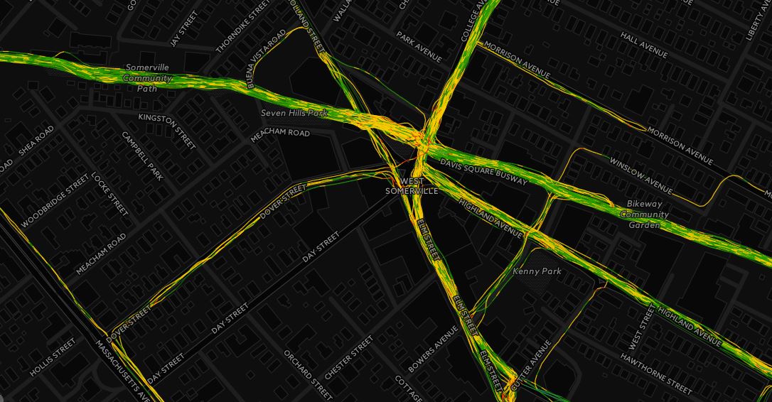
As most runners do, I run a lot of the same routes over, and over again. During a run yesterday, I had the idea that I could pull all my runs on my three mile loop and race them against each other using CARTO‘s Torque feature. It took a little bit of data prep to get my GPS data into a format to “race itself”, but I will spare the technical details for later.
Here are 25 separate runs I ran from 2016 on my Somerville 3 mile loop. Each point is the lead GPS point of an individual run, with time steps synced, visualized by meters per second speed. To see the full size, click here (it is much better in full size).
Couple points about the race
- Winner – 10/11/2016 – 3.13 miles, 19:10 time,6:07 pace
- Loser – 12/12/2016 – 3.13 miles, 24:26, 7:48 pace
- There are a few deviations on the route, especially at the end. This is because of number of factors, either because I made a different turn or had to run a little longer to get the required distance due to GPS errors earlier in the run.
- I am able to race myself because the data I generate with runBENrun project uses elapsed time, so I am able to compare run against run.
- I used a Nike+ watch, and scraped the data into my own environment using Smashrun, tapiriik, and my own code.
- The very last point to leave the map is a run where I didn’t turn off my watch at the end and walked into my house!
Here is How I Created the Race
Warning – Technical Details Ahead! Ahh Yeah!
In 2016, I ran my Somerville loop 25 times. It’s a pretty flat and fast course, that has a good long straightaway down the bike path, but it does have a couple tight turns and pauses waiting for traffic to cross Broadway.

I run this loop in many different phases of training periods. Sometimes I try to run fast on this loop, but other times I am using this course for a recovery run. As I was preparing the data I thought my pace and times would be all over the place.
First step was to run a query against all of my 2016 runs to find all three mile runs, that where not classified as interval runs (github here). The script returns any run that rounds to three miles. So I had to do some post processing.

The query returned 42 three mile runs in 2016. The next step was to pull all of the shapefiles I generated for these datasets a while back (code here!) and check the routes using QGIS. I removed a number of races I ran, and a few three mile runs that weren’t along this route. Once the set was cleaned, I ended up with following 25 runs.

You will notice that the routes don’t all follow the same path. In fact, I often end at different places on different streets. This is for a couple reasons: I may have to run a little extra at an end of a run due to pauses in my GPS, or I took a turn a little early toward the end of the run down and I had to make up the distance at the end. Overall, the 25 runs represent a pretty consistent route.
Querying my runBENrun database, I can get my stats for the 25 runs, and checkout how consistent, or inconsistent, I am on this route (github here). The spread of times isn’t too bad, so it should show a decent race.

From here, I wrote a script to create a postgreSQL table with all the relevant runs from the master GPS point table for 2016 (github here). I made sure to cast the finaltimecounter column as time so that I could use it in CARTO later on.

The output table contains over 29k points, as seen below. This dataset is what I need to use in CARTO for the animation using Torque. Using QGIS, I exported the dataset as a GEOJSON. Why GEOJSON? Because I had a time field and shapefiles don’t play nice with time data.

I imported the GEOJSON dataset into CARTO and then used the following settings in the Torque Cat wizard. I found the following settings gave the best view of the “race.” CARTO is super easy to use, and the Torque Cat tool provided a lot of options to make the map look really sharp.

In the end, I got a nice map showing me race myself. I have a few ideas on how to improve the map and data, but that will be for another time.
Thanks for reading.
